*** START OF THE PROJECT GUTENBERG EBOOK 63087 ***
COLOR STANDARDS
AND
COLOR NOMENCLATURE
RIDGWAY
[Illustration: Color Wheel]
FIFTY-THREE COLORED PLATES
ELEVEN HUNDRED AND FIFTEEN NAMED COLORS
COLOR STANDARDS
AND
COLOR NOMENCLATURE
BY
ROBERT RIDGWAY, M.S., C.M.Z.S., Etc.
Curator of the Division of Birds, United States
National Museum.
With Fifty-three Colored Plates
and
Eleven Hundred and Fifteen Named Colors.
WASHINGTON. D. C.
1912.
Published by the Author.
Copyright, 1912
by
Robert Ridgway
PRESS OF
A. HOEN & COMPANY
BALTIMORE, MD
TO
Señor Don JOSÉ C. ZELEDÓN
OF
SAN JOSÉ, COSTA RICA
True and steadfast friend for more than two-score years; host, guide,
and companion on excursions among the glorious forests, magnificent
mountains, and lovely plains of his native land; whose encouragement
made possible the completion of a seemingly hopeless task, this book
is affectionately and gratefully dedicated.
PREFACE
The motive of this work is THE STANDARDIZATION OF COLORS AND COLOR
NAMES.
The terminology of Science, the Arts, and various Industries has been
a most important factor in the development of their present high
efficiency. Measurements, weights, mathematical and chemical formulæ,
and terms which clearly designate practically every variation of form
and structure have long been standardized; but the nomenclature of
colors remains vague and, for practical purposes, meaningless, thereby
seriously impeding progress in almost every branch of industry and
research.
Many works on the subject of color have been published, but most of
them are purely technical, and pertain to the physics of color, the
painter's needs, or to some particular art or industry alone, or in
other ways are unsuited for the use of the zoologist, the botanist,
the pathologist, or the mineralogist; and the comparatively few
works on color intended specially for naturalists have all failed to
meet the requirements, either because of an insufficient number of
color samples, lack of names or other means of easy identification
or designation, or faulty selection and classification of the colors
chosen for illustration. More than twenty years ago the author of the
present work attempted to supply the deficiency by the publication
of a book[1] containing 186 samples of named colors, but the effort
was successful only to the extent that it was an improvement on its
predecessors; and, although still the standard of color nomenclature
among zoologists and many other naturalists, it nevertheless is
seriously defective in the altogether inadequate number of colors
represented, and in their unscientific arrangement. Fully realizing his
failure, the author, some two or three years later, began to devise
plans, gather materials, and acquire special knowledge of the subject,
in the hope that he might some day be able to prepare a new work which
would fully meet the needs of all who have use for it. Unfortunately,
his time has been so fully occupied with other matters that progress
has necessarily been slow; but after more than twenty years of sporadic
effort it has at last been completed.
Acknowledgments are due to so many friends for helpful suggestions
that it is hardly possible to name them all, or to specify the extent
or kind of help which each has rendered; but special mention should be
made of Mr. LEWIS E. JEWELL, of Johns Hopkins University; Dr. R. M.
STRONG, of the University of Chicago; Prof. W. J. SPILLMAN, of the U.
S. Department of Agriculture; Mr. WILLIAMS WELCH, of the U. S. Signal
Service; Mr. MILTON BRADLEY, of Springfield, Mass.; Dr. P. G. NUTTING,
of the U. S. Bureau of Standards; Mr. P. L. RICKER, of the Bureau of
Plant Industry, U. S. Department of Agriculture; and Mr. J. L. RIDGWAY,
of the U. S. Geological Survey. The late Professor S. P. LANGLEY, then
Secretary of the Smithsonian Institution, was good enough to take a
kindly interest in this undertaking and gave the author assistance
for which he is glad to make acknowledgment. More than to all others,
however, is the author deeply indebted to Mr. John E. THAYER, of
Lancaster, Mass., and Señor Don JOSÉ C. ZELEDÓN, of San José, Costa
Rica, for aid so indispensible that without it the work could not have
been completed.
To Dr. G. GRÜBLER & CO., of Leipzig, Germany, the author is under
obligations for the gift of a nearly complete set of their celebrated
coal-tar dyes, which have proven quite necessary to the work,
especially in the coloring of the Maxwell disks on which the color
scheme is based.
The reproduction of the plates has been a difficult matter, involving
not only expensive experimentation, but more than three years of
unremitting labor. Vastly different from the ordinary lines of
commercial color work, the correct copying of each one of the 1115
colors of the original plates developed many perplexing and often
discouraging problems, which were finally solved through Mr. A. B.
HOEN'S expert knowledge of chemistry and pigments; the skill, industry,
and patience of the firm's head colorist, Mr. FRANK PORTUGAL, and the
personal interest of both these gentlemen. It is, therefore, with the
greatest pleasure that the author's grateful acknowledgment is made to
the firm of A. HOEN & COMPANY for the satisfactory manner in which they
have fulfilled their contract.
CONTENTS
PAGE
PREFACE i
PROLOGUE 1
Plan 1
Color Names 9
Color Terms 15
Table of percentages of Component Colors in Spectrum Hues 21
Table of percentages of White and Black in Tone Scales 23
Table of percentages of Neutral Gray in Broken Colors 25
Table of percentages of Black and White in tones of Carbon Gray 25
Dyes and Pigments used in Coloring of Maxwell Disks 26
Alphabetical List of Colors represented on Plates 29
Colors of old edition Not Represented on Plates 41
List of Useful Books on Color 42
PROLOGUE
As stated in the Preface, the purpose of this work is the
standardization of colors and color nomenclature, so that naturalists
or others who may have occasion to write or speak of colors may do so
with the certainty that there need be no question as to what particular
tint, shade, or degree of grayness, of any color or hue is meant.
Therefore, it is unnecessary to treat of the subject from any other
point of view; it will be sufficient to say that this work is based
on a thorough study of the subject from every standpoint, and that
practically all authoritative works on the subject of color have been
carefully consulted.[2]
PLAN. —The scientific arrangement of colors in this work is based
essentially on the suggestions of Professor J. H. Pillsbury for a
scheme of color standards,[3] which have also been the basis of several
other efforts toward the same end, as the plates in Milton Bradley's
"Elementary Color" and educational colored papers, Prang's charts of
standard colors, Klinkseick and Valette's "Code des Couleurs," etc.;
but while all these present a scientifically arranged color-scheme and
more or less adequate number of colors they all fail to supply a ready
or convenient means of identifying and designating the colors—the
principal utility of a work of this kind. It is in the latter respect
that the present work is believed to meet, more nearly than any other
at least, this essential requirement, and in this consists whatever
originality may be claimed for it.
The "key" to the classification or arrangement herewith presented is,
of course, the solar spectrum, with its six fundamental colors and
intermediate hues, augmented by the series of hues connecting violet
with red, which the spectrum fails to show. If, with the red-violets
and violet-reds thus added to the spectrum hues, the band forming
this scale be joined end to end a circle is formed in which there is
continuously a gradual change of hue, step by step, from red through
orange-red and red-orange to orange; orange through yellow-orange and
orange-yellow to yellow; yellow through green-yellow and yellow-green
to green; green through blue-green and green-blue to blue; blue through
violet-blue and blue-violet to violet; and violet through red-violet
and violet-red to red—the starting-point—with intermediate connecting
hues. In the solar spectrum, both prismatic and grating, but especially
the former, the spaces between the adjoining distinct colors are very
unequal; therefore for the present purpose an ideal scale must be
constructed, so that an approximately equal number of equally distinct
connecting hues shall be shown. Distinctions of hue appreciable to the
normal eye are so very numerous[4] that the criterion of convenience
or practicability must determine the number of segments into which the
ideal chromatic scale or circle may be divided in order to best serve
the purpose in view. Careful experiment seems to have demonstrated
that thirty-six is the practicable limit, and accordingly that number
has been adopted.[5] If the number of intermediate hues were equal
in all cases there would, in this scheme, be five between each two
adjacent fundamental colors of the spectrum; but a greater number of
recognizably distinct hues is obviously necessary in some cases than in
others; for example, spectrum orange is decidedly nearer in hue to red
than to yellow, and therefore the number of intermediates required on
each side of the orange is different, being in the proportion of four
for the red-orange series to five for the orange-yellow, and similarly
six are required for the violet-red series, while four suffice for the
blue-violet hues.
There is no known means by which we can measure the proportion of
two or more _pigments_ in any given mixture, "because color-effect
cannot be measured by the pint of mixed paint or the ounce of dry
pigment;"[6] but, fortunately, we have a very exact method, in the
color-wheel and Maxwell disks, by which the relative proportions of
two or more _colors_ in any mixture may be precisely measured. This
method has been used in the painting of every one of the 1115 colors
of the present work, by means of one disk to represent each one of the
thirty-six colors (both pure and "broken"), together with a black, a
white, and a neutral gray disk, the last being a match in color to
the gray resulting from the mixture of red, green and violet on the
color-wheel;[7] the neutral gray disk, however, being used only for
the making of disks for the broken series of colors (′, ′′, ′′′, ′′′′,
and ′′′′′) and for the scale of neutral grays (Plate LIII.) These
colored disks are slit on one side from center to circumference, and
therefore by interlocking two or more they may be adjusted so that
either occupies any desired percentage of the whole area, which may be
very precisely determined by a scale of 100 segments shown on the outer
edge of a larger disk on which the colored disks are superimposed. When
connected with the color-wheel and adjusted as may be desired, and then
rapidly revolved, the two or more distinct colors resolve themselves
into a single uniform composite color, whose elements are shown, in
their relative proportion, by the scale surrounding the disks.[8]
The scales (both horizontal and vertical) of the present work are
all prepared directly from definite color-wheel formulæ, based on
carefully calculated curves; the thirty-six pure spectrum hues,
represented by the middle horizontal line of color-squares on Plates
I-XII (together with an equal number of intermediates represented by
blank spaces), requiring a separate curve and consequently different
relative proportions of the two component colors for each series
of hues—that is, the series from red to orange, orange to yellow,
yellow to green, green to blue, blue to violet, and violet to red,
respectively; but the progressive increments of white in the scales
of tints, black in those of shades, and neutral gray in the several
series of broken colors are exactly the same in every case. The first
series of Plates (I-XII) shows the pure, full spectrum colors and
intermediate hues (middle horizontal line, nos. 1-72),[9] each with its
vertical scale of tints (upward, _a-g_) and shades (downward, _h-n_),
the increments of white for the tints being 9.5, 22.5, and 45 per
cent., respectively, those of black in the shades being 45, 70.5, and
87.5 per cent. The remaining Plates show these same thirty-six colors
or hues in exactly the same order and similarly modified (vertically)
by precisely the same progressive increments of white (upward) and
black (downward), but all the colors are dulled by admixture of neutral
gray; the first series (1′-72′, Plates XIII-XXVI) containing 32 per
cent. of neutral gray, the second (1′′-72′′, Plates XXVII-XXXVIII) 58
per cent., the third (1′′′-72′′′, Plates XXXIX-XLIV) 77 per cent.,
and the fourth (1′′′′-72′′′′, Plates XLV-L) 90 per cent. The last
three Plates (LI-LIII) show the six spectrum colors[10] (also purple,
the intermediate between violet and red) still further dulled by
admixture of 95.5 per cent. of neutral gray, these being in reality
colored grays; to which are added a scale of neutral gray and one of
carbon gray, the former being the gray resulting from mixture of the
three primary colors (red 32, green 42, violet 26 per cent., which in
relative darkness equals black 79.5, white 20.5 per cent.); the latter
being the gray produced by mixture of lamp black and Chinese white, and
the scale a reproduction of that in the author's first "Nomenclature of
Colors" (1886, Plate II, nos. 2-10). It should be emphasized that in
all cases except the scale of carbon grays, only the disks representing
the middle horizontal series of colors (both pure and broken) have been
used, in combination with a black and a white disk, respectively, to
make the colors of the vertical scales of tints and shades.
The coloring of a satisfactory set of disks to represent the thirty-six
pure spectrum colors and hues was a matter of extreme difficulty, many
hundreds having been painted and discarded before the desired result
was achieved. Several serious problems were involved, the matter of
change of hue through chemical reaction of the combined pigments or
dyes[11] (especially the latter) being almost as troublesome as that
of securing the proper degree of difference between each adjoining
pair of hues. The method by which satisfactory results were finally
secured was as follows: First, six disks were colored to represent
each of the fundamental spectrum colors, according to the author's
conception of them.[12] These six disks were then placed against a
suitable background (a neutral gray), in spectrum sequence, with wide
intervals for the accommodation of connecting series of disks, which
were then colored so as to represent an apparently even transition
from one to the other. When this very difficult task had been done as
well as the eye alone could judge, each intermediate was then measured
on the color-wheel and the relative proportions (in percentages) of
its two component colors recorded. After this had been done for all
the intermediate hues each series (the red-orange, orange-yellow,
yellow-green, green-blue, blue-violet, and violet-red) was taken
separately and a curve constructed on cross-section paper from the
recorded ratios. These curves were found to be in all cases more or
less irregular or unsymmetrical, but nevertheless were sufficiently
near correct to serve as a basis for a symmetrical curve; and after the
points out of proper line were suitably relocated the two component
colors were correspondingly readjusted on the color-wheel and each
faulty disk corrected (or a new one painted) until it exactly matched
the required combination. The scales representing the tints and shades
of each color, and also the gray or broken colors were similarly
determined by corrected curves.[13]
By the method adopted of running each of the thirty-six spectrum hues
through a scale of tints and shades, and repeating the combination
through several series modified by increasing increments of neutral
gray, practically the entire possible range of color variation is
covered,[14] rendering it an easy matter to locate in the plates,
either among the colors actually shown or in an intermediate space,
any color which it is desired to match; and where short distinctive
names have not been found (their place being, tentatively, supplied by
compound names), as, necessarily, must often be the case, any color
or intermediate between any two colors, either as to hue, tint, or
shade, may be readily designated by the very simple system of symbols
(numerals and letters) employed.[15]
In order to designate any color for which a satisfactory name cannot
be found, or one not represented on the plates, it is only necessary
to proceed as follows: Suppose the color in question is nearest 1 on
Plate I; say, for example, is intermediate in hue between 1 (spectrum
red) and 3 (scarlet-red), or in other words if represented in color its
position would be in the uncolored space designated as no. 2; and in
tone between the full color (middle horizontal line) and tint _b_. Its
designation, therefore, is _2a_. Exactly the same method applies to any
of the other blank spaces, as well as to the colors themselves, except
that in case of the broken colors the "primes" (′, ′′, ′′′, ′′′′, or
′′′′′) are to be affixed to the hue number. First locate the _hue_,
designated by number, then the _tone_, designated by lower case letter,
the full, pure colors of the middle horizontal row being designated by
number alone.
Color Names.—While it is true that the naming of colors as usually
employed has so little to do with the purely technical aspects of
chromatology or color-physics that, as Von Bezold remarks[16] "we are
in reality dealing with the peculiarities of language," it is equally
true that a collection of color standards designed expressly for the
purpose of identifying and designating particular colors can best
attain this object by the use of a carefully selected nomenclature.
In other words, the prime necessity is to standardize both colors and
color names, by elimination of the element of "personal equation"
in the matter. In no other way can agreement be reached as to the
distinction between "violet" and "purple," two color names quite
generally used interchangeably or synonymously but in reality belonging
to quite distinct hues, or that any other color name can be definitely
fixed. Various methods of handling the matter of color in zoological
and botanical descriptions, etc., by the avoidance of color names and
substitution therefor of symbols, numerals, or mechanical contrivances
(as color-wheel and spectrum analyses, color-spheres, etc.) have been
devised but all have been found impracticable or unsatisfactory.
The author has taken the trouble to get an expression of opinion in
this matter from many naturalists and others, and the preference for
color-names very greatly predominates; consequently, whenever it has
been possible to find a name which seems suitable for any color in
this work it has been done, leaving as few as possible unnamed, and
for these some other means must be devised for their designation. (See
page 8). The selection of appropriate names for the colors depicted on
the Plates has been in some cases a matter of considerable difficulty.
With regard to certain ones it may appear that the names adopted are
not entirely satisfactory; but, to forestall such criticism, it may be
explained that the purpose of these Plates is not to show the color
of the particular objects or substances which the names suggest, but
to provide appropriate, or at least approximately appropriate, names
for the colors which it has seemed desirable to represent. In other
words, certain colors are selected for illustration, for which names
must be provided; and when names that are exclusively pertinent or
otherwise entirely satisfactory are not at hand, they must be looked
up or invented. It should also be borne in mind that almost any object
or substance varies more or less in color; and that therefore if
the "orange," "lemon," "chestnut" or "lilac" of the Plates does not
exactly match in color the particular orange, lemon, chestnut or lilac
which one may compare it with, it may (in fact does) correspond with
other specimens. Without standardization, even if arbitrary, color
nomenclature must, necessarily, remain in its present condition of
absolute chaos. Even the standard pigments are not constant in color,
practically every one of them being subject to more or less variation
in hue or tone, different samples from the same manufacturer sometimes
varying to the extent of several tones or hues of the present work;
indeed, in every case where two or more samples of the same color
have been compared it has been found that no two are exactly alike,
the difference often being very great. For example: Of five samples
of "vandyke brown" only two are approximately similar, each of the
other three being widely different, not only from one another but from
the other two, one being a blackish brown, another reddish brown, the
third a yellowish orange-brown. Of eleven samples of "olive" no two
are closely similar, the color ranging from a shade of dull (grayish)
blue-green to orange-brown, dark brownish gray, and light yellowish
olive; and the same or nearly the same degree of variation is seen
in absolutely every color examined, showing very clearly the utter
worthlessness of color names unless fixed or standardized.
In order to obtain as many color names as possible for standardization
it has been necessary to draw from all available sources. Several
thousand samples of named colors have therefore been collected, and
for convenience of reference and comparison gummed to card catalogue
cards, with the name, source, and other data thereon. These include
the colors from many standard works, among them Werner's "Nomenclature
of Colours" (Syme's edition, 1821), Hay's "Nomenclature of Colours"
(1846), Ridgway's "Nomenclature of Colors" (1886), Saccardo's
"Chromataxia" (1891), Mathews' "Chart of Correct Colors of Flowers"
(American Florist, 1891), Willson and Calkins' "Familiar Colors,"
Oberthur and Dauthenay's "Repertoire des Couleurs" (1905), Leidel's
"Hints on Tints" (1893), "Lefévré's Matieres Colorantes Artificiales"
(1896), the Standard Dictionary chart of "typical colors," the
educational colored papers of Milton Bradley and Prang, and many
others; and besides these practically all of the artists' oil, water,
and dry colors, manufactured by Winsor and Newton, F. Schoenfeld and
Co., Charles Roberson and Co., George Rowney and Co., Madderton and
Co., R. Ackermann and Co., Bourgeois, Binant, Chenal, Le Franc, Devoe,
Raynolds, Osborne, Bradley, Hatfield and others; also the coal-tar or
aniline dyes of Dr. G. Grübler & Co., Continental Color and Chemical
Co., and Henry Heil Chemical Co., and the well known Diamond Dyes;
chromo-lithographic inks, embroidery silks, etc., etc.
The material from which to select suitable color names was greatly
augmented, almost at the last moment, from two sources, as follows: (1)
A very large collection of color-samples (unfortunately mostly unnamed)
collected and mounted on cards by Mr. Frederick A. Wampole, a talented
young artist, to whom was delegated, by a Committee of the American
Mycological Society, the task of preparing a nomenclature of colors
based upon spectroscopic determinations, but which, unfortunately,
the untimely death of Mr. Wampole prevented from progressing beyond
the accumulation of this collection. For the use of this material I
am indebted to the courtesy of Dr. Frederick V. Coville, Botanist of
the U. S. Department of Agriculture, and Mr. P. L. Ricker, Assistant
Botanist, Bureau of Plant Industry, in the same Department. (2) A
splendid collection of colored Japanese silks, taffetas, velvets, and
other dress goods, kindly sent me by Mr. C. H. Hospital, of the silk
department of the firm of Woodward and Lothrop, Washington, D. C. The
very large number of colors represented in this collection are all
named and have afforded a considerable number of the names adopted in
the present work.
For obvious reasons it has, of course, been necessary to ignore many
trade names, through which the popular nomenclature of colors has
become involved in really chaotic confusion rendered more confounded
by the continual coinage of new names, many of them synonymous and
most of them vague and variable in their application. Most of them
are invented, apparently without care or judgment, by the dyer or
manufacturer of fabrics, and are as capricious in their meaning as in
their origin; for example: Such fanciful names as "zulu," "serpent
green," "baby blue," "new old rose," "London smoke," etc., and such
nonsensical names as "ashes of roses" and "elephant's breath." An
inspection of the sample books of manufacturers of fancy goods (such
as embroidery silks and crewels, ribbons, velvets, and other dress-
and upholstery-goods) is sufficient not only to illustrate the
above observations, but to show also the absolute want of system or
classification and the general unavailability of these trade names for
adoption in a practical color nomenclature. This is very unfortunate,
since many of these trade names have the merit of brevity and euphony
and lack only the quality of stability.
It has been difficult for the author to decide whether the standards
of his original "Nomenclature of Colors" (1886) should be retained
in the present work. Some of them are admittedly wrong (indeed,
certain ones are not as they were intended to be); besides, owing to
the method of reproducing the originals (hand stenciling) there is
considerable variation in different copies of the book, one or more
reprints, necessitating new mixtures of pigments, adding to this lack
of uniformity.[17] Many persons, however, have urged the retention of
the old standards, on the ground that they have been used by so many
zoologists and botanists in their writings during the last twenty-five
years that they have become established through common usage. This
very important consideration has induced the author to retain such of
the old standards as can be matched in the present work, even though
some of them do not agree strictly with either his own or the usual
conception of the colors in question. An asterisk (*) preceding a color
name indicates that the name in question is adopted from the older
work, the variation between different copies of the work requiring
the selection, in the new one, of a color representing as nearly as
possible an average of the former.
In any systematically arranged scheme, unless the number of colors
shown is practically unlimited, it will, necessarily, be impossible
to find represented thereon a certain proportion of colors comprised
among even a very limited number selected at random, or only roughly
classified. Hence many (thirty-six, or more than five per cent.) of the
colors shown in the old "Nomenclature of Colors" fall into the blank
intervals of the present work, being intermediate either in hue or
tone, or chroma, sometimes all. It is necessary of course to provide
some means for the correlation of these with the present scheme, which
is done by the list on page 41, where the position of each is shown.
The question of giving representations of metallic colors in this
work was at one time considered; but the idea was abandoned for the
reason that these are in reality only ordinary colors reflected from
a metallic or burnished surface, or appearing as if so reflected; the
actual hue is precisely the same, though often changeable according to
angle of impact of the light rays, and relative position of the eye,
this changeableness being sometimes due to interference.[18] Colors
again vary, without actual difference of hue, in regard to quality of
texture or surface; that is to say, the color may be quite lustreless,
appearing on a dull, sometimes velvety surface, while again it may be
more or less glossy, even to the degree of appearing as if varnished.
To deal with these variations, however, requires simply the use of
suitable adjectives. For example: To indicate a color which has no
lustre or brightness, the adjective matt (or mat) may be used, in
preference to _dull_, which implies reduction in purity or chroma;
other adjectives, appropriate in special cases, being velvety, glossy,
burnished metallic, matt-metallic, etc.
Color Terms.—No other person has presented so forcibly the urgent need
for reform in popular nomenclature nor stated so clearly and concisely
its shortcomings and the simple remedy, as Mr. Milton Bradley, from
one of whose educational pamphlets on the subject[19] the following is
quoted: "The list of words now employed to express qualities or degrees
of color is very small, in fact a half dozen comprise the more common
terms, and these are pressed into service on all occasions, and in such
varied relations that they not only fail to express anything definite
but constantly contradict themselves.... Tint, Hue and Shade are
employed so loosely by the public generally, even by those people who
claim to use English correctly, that neither word has a very definite
meaning, although each is capable of being as accurately used as any
other word in our every day vocabulary"....
Certainly one would expect that men of learning, at least, would employ
the broader color terms correctly; but some of the highest authorities
on color-physics habitually use them interchangeably, as if they were
quite synonymous; and even the dictionaries, with few exceptions, give
incorrect or "hazy" definitions of these terms. It is not strictly
correct to say a "dark tint" or "light shade" of any color, because a
_tint_ implies a color _paler_ than the full color, while a shade means
exactly the opposite; and to say an "orange shade (or tint) of red,"
a "greenish shade (or tint) of blue," a "bluish shade (or tint) of
violet," etc., is an absurdity, for the term _hue_, which specifically
and alone refers to relative position in the spectrum scale, without
reference to lightness or darkness, is the only one which can correctly
be used in such cases.
Indeed the standardization of color terms is almost if not quite
as important, in the interest of educational progress, as that of
the colors themselves and their names; therefore, to make easy a
clear understanding of the specific meaning of each, the following
definitions are given:—
_Color._—The term of widest application, being the only one which can
be used to cover the entire range of chromatic manifestation; that is
to say, the spectrum colors (together with those between violet and
red, not shown in the spectrum) with all their innumerable variations
of luminosity, mixture, etc. In a more restricted sense, applied to the
six distinct spectrum colors (red, orange, yellow, green, blue, and
violet), which are sometimes distinguished as _fundamental colors_ or
_spectrum colors_.
_Hue._—While often used interchangeably or synonymously with color,
the term _hue_ is more properly restricted by special application
to those lying between any contiguous pair of spectrum colors (also
between violet and purple and between purple and red); as an orange
_hue_ (not shade or tint, as so often incorrectly said) of red; a
yellow _hue_ of orange; a greenish _hue_ of yellow; a bluish _hue_ of
green; a violet _hue_ of blue, etc.
_Tint._—Any color (pure or broken) weakened by high illumination or
(in the case of pigments) by admixture of white, or (in the case of
dyes or washes) by excess of aqueous or other liquid medium; as, a
deep, medium, light, pale or delicate (pallid) _tint_ of red. The term
cannot correctly be used in any other sense.
_Shade._—Any color (pure or broken) darkened by shadow or (in the case
of pigments) by admixture of black; exactly the opposite of _tint_; as
a medium, dark, or very dark (dusky) _shade_ of red.
_Tone._—"Each step in a color scale is a tone of that color."[20]
The term tone cannot, however, be properly applied to a step in the
spectrum scale, in which each contiguous pair of the six distinct
spectrum or "fundamental" _colors_ are connected by _hues_. Hence
_tone_[21] is exclusively applicable to the steps in a scale of
a single color or hue, comprising the full color (in the center)
and graduated tints and shades leading off therefrom in opposite
directions; or of neutral gray similarly graduated in tone from the
darkest shade to the palest tint. Each one of the colored blocks in the
vertical scales of the plates in this work represents a separate tone
of that color.
_Scale._—A linear series of colors showing a gradual transition from
one to another, or a similar series of tones of one color. The first
is a _chromatic scale_[22] (or scale of colors and hues) and in the
plates of this work is represented by each horizontal series; the
second is a _tone scale_, on the plates running vertically, growing
from the full color, in the center, to a pale tint (at the top) and
a dark shade (at the bottom). For clearer comprehension of these
two distinct scales, each plate of this work may be compared to a
sheet of woven fabric; the chromatic scale (horizontal) representing
the warp, the luminosity or tone scale (vertical) the woof. A third
kind of color scale is represented by adding progressive increments
of neutral gray to any color. This is shown by the several series
of Plates, of which the first (Plates I-XII, with colors numbered
1-71) represents each step in the spectrum scale unmixed with gray,
followed by five other series in which the same colors[23] are shown
dulled by gradually increasing increments of neutral gray, the first
(Plates XIII-XXVI, colors 1′-71′) containing 32 per cent., the second
(Plates XXVII-XXXVIII, colors 1′′-71′′) 58 per cent., the third (Plates
XXXIX-XLIV, colors 1′′′-69′′′) 77 per cent., the fourth (Plates XLV-L,
colors 1′′′′-69′′′′) 90 per cent., and the fifth (Plates LI-LIII,
colors 1′′′′′, 15′′′′′, 23′′′′′, 35′′′′′, 49′′′′′, 59′′′′′ and 67′′′′′)
95.5 per cent. of gray, the last being in reality colored grays.
Finally scales are shown (on Plate LIII) of neutral gray (in which
all trace of color is wanting), and of carbon gray, a simple mixture
of lamp-black and chinese white. It is not easy to find a suitable
name for these scales of reduced or "broken" colors, but they may, for
present convenience, be termed _reduced_ or _broken scales_.
_Full Color._—A color corresponding in intensity with its
manifestation in the solar spectrum.
_Pure Color._—A color corresponding in purity with (or, in the case of
material colors, closely approximating to) one of the spectrum colors.
_Broken Color._—Any one of the spectrum colors or hues dulled or
reduced in purity by admixture (in any proportion) of neutral gray, or
varying relative proportions of both black and white; also produced
by admixture of certain spectrum colors, as red with green, orange
with blue, yellow with violet, etc. These broken colors are far more
numerous in Nature than the pure spectrum colors, and include the
almost infinite variations of brown, russet, citrine, olive, drab, etc.
They are often called dull or neutral colors.
_Fundamental Colors._—The six psychologically distinct colors of the
solar spectrum; Red, Orange, Yellow, Green, Blue, and Violet.
_Primary Colors._—Theoretically, any of the spectrum colors which
cannot be made by mixture of two other colors. According to the
generally accepted Young-Helmholtz theory, the primary colors are
red, green, and violet: orange and yellow resulting from a mixture of
red and green, and blue from a mixture of green and violet. There is
considerable difference of opinion, however, as to this question, and
further investigation of the subject seems to be required; at any rate,
authorities fail to explain why red may be exactly reproduced (except
as to the degree of luminosity) by a mixture of orange and violet,
exactly as yellow results from mixture of red and green or blue from
green or violet, green being, in fact, the only spectrum color that
cannot be made by mixture of other colors.[24]
_Chroma._—Degree of freedom from white light; purity, intensity or
fullness of color.
_Luminosity._—Degree of brightness or clearness. The relative
luminosity of the spectrum colors is as follows: [Yellow (brightest)?],
orange yellow; orange; greenish-yellow, yellow-green, and green;
orange-red; red and blue (equal); violet-blue, blue-violet, violet.[25]
_Warm Colors._—The colors nearer the red end of the spectrum or those
of longer wave-lengths (red, orange, and yellow, and connecting hues)
"and combinations in which they predominate."[26]
_Cool, or Cold, Colors._—The colors nearer the violet end of
the spectrum or those of shorter wave-length, especially blue and
green-blue. "But it is, perhaps, questionable whether green and violet
may be termed either warm or cool."
_Complementary Color._—"As white light is the sum of all color, if
we take from white light a given color the remaining color is the
complement of the given color." When any two colors or hues which when
combined in proper proportion on the color-wheel produce, by rotation,
neutral gray, these two colors each represent the complementary of the
other.
_Constants of Color._—The constants of color are numbers which measure
(1) the wave-length, (2) the chroma, and (3) the luminosity.
In addition to the terms defined above there are many others, for which
the reader is referred to the chapter on "Color Definitions" on pages
23-30 of Milton Bradley's excellent and most useful book "Elementary
Color."
TABLE OF PERCENTAGES OF COMPONENT COLORS IN THE CONNECTING HUES OF THE
CHROMATIC SCALE.
The following table shows the relative percentages, in color-wheel
measurement, of the two components in each of the hues connecting
adjacent pairs of the six spectrum colors as represented on the
original Plates of this work; together with an equal number of exact
intermediates (not shown on the Plates), the latter in lower-case type
and not indicated by symbols.
Number. Color. Red. Orange. Yellow. Green. Blue. Violet. Wavelength.[27]
1 Red 100 644
2 90 10
3 O-R 80 20
4 70 30
5 OO-R 60 40
6 50 50
7 R-O 40 60
8 30 70
9 OR-O 20 80
10 10 90
11 Orange 100 598
12 96 4
13 OY-O 91 9
14 86 14
15 Y-O 80 20
16 73.5 26.5
17 O-Y 65 35
18 56.5 43.5
19 YO-Y 47 53
20 36.5 63.5
21 O-YY 25 75
22 13.5 86.5
23 Yellow 100 577
24 87 13
25 YG-Y 75 25
26 64 36
27 G-Y 55 45
28 46 54
29 GG-Y 39 61
30 31 69
31 Y-G 24 76
32 17 83
33 GY-G 11 89
34 6 94
35 Green 100 520
36 96.5 3.5
37 GB-G 93 7
38 90 10
39 B-G 85 15
40 81 19
41 BB-G 75 25
42 69 31
43 G-B 61 39
44 54 46
45 BG-B 45 55
46 36 64
47 G-BB 25 75
48 13 87
49 Blue 100 473
50 84 16
51 BV-B 72 28
52 64 36
53 V-B 54 46
54 47 53
55 B-V 40 60
56 32 68
57 VB-V 22 78
58 12 88
59 Violet 100 410
60 3 97
61 VR-V 7 93
62 11 89
63 R-V 18 82
64 24 76
65 RR-V 33 67
66 41 59
67 V-R 52 48
68 64 36
69 RV-R 74 26
70 83 17
71 V-RR 90 10
72 95.5 4.5
TABLE SHOWING PERCENTAGE OF WHITE AND BLACK, RESPECTIVELY, IN EACH TONE
OF THE TONE OR LUMINOSITY SCALES.
All of the vertical scales in the original Plates of this work (the
scale of carbon grays alone excepted) contain the following percentages
by color-wheel measurement:
TONE. PERCENTAGES.
White. Color. Black.
(White) 100
(g) 70 30
f 45 55
(e) 32 68
d 22.5 77.5
(c) 15 85
b 9.5 90.5
(a) 5 95
(Full Color) 100
(h) 64 26
i 55 45
(j) 41 59
k 29.5 70.5
(l) 20 80
m 12.5 87.5
(n) 6 94
(Black) 100
One of the most serious difficulties encountered in the preparation
of the Plates of this work was the apparent impracticability of
reproducing satisfactory shades of pure colors. This originated in the
fact that there seems to be no substance (pigment, dye, or fabric)
which represents a true black, all reflecting more or less of white
light, and consequently producing shades which are dull or broken.
The difficulty is increased by the additional fact that any black
pigment mixed with almost any color falls short of even the color-wheel
mixture in purity of hue in the resulting shades, owing to the very
considerable amount of gray in all black pigments. Chromolithography
can be made to produce clearer and better shades of the pure colors,
but is distinctly objectionable for the purpose of a work of this
kind owing to eventual oxidation of the oil or varnish with which the
pigments are combined in lithographic inks, causing a change of hue;
reds becoming more orange, blues more greenish, etc., in course of time.
While the absence (in large part) of pure chromatic shades is much
to be regretted, the defect is not so serious, _from the standpoint
of utility_, as might appear at first sight; for while saturated or
darkened pure colors are not uncommon in the animal, vegetable, and
mineral kingdoms, more or less broken dark colors are infinitely more
so; and since the latter are greatly increased in number by the defect
mentioned the actual result is rather an advantage than otherwise.
It will doubtless be noticed that there is a conspicuous difference
in relative darkness between shades of yellow and contiguous hues on
the one hand and corresponding ones of violet and adjacent hues on the
other, as if the percentage of black in each were very different. This,
however, is entirely the result of difference of luminosity of the
two sets of colors, that of yellow being between 7000 and 8000 while
that of violet is only about 13;[28] for the percentage of black in
corresponding tones of the vertical scales is precisely the same for
each color throughout the chromatic scale of this work.
TABLE SHOWING PERCENTAGES OF NEUTRAL GRAY IN THE BROKEN COLOR SCALES.
Every Plate in each series of broken colors (′ to ′′′′′) contains
exactly the same percentage of neutral gray in each color, the relative
amount increasing progressively in the several series, as shown in the
following table. The percentages of white in the tints and of black in
the shades of the tone scales are in all cases exactly the same as in
the tone scales of pure colors.
SERIES. PERCENTAGES.
Color. Neutral Gray.
Pure Colors 100
(′) 68 32
(′′) 42 58
(′′′) 23 77
(′′′′) 10 90
(′′′′′) 4.5 95.5
Neutral Gray 100
TABLE OF PERCENTAGE OF BLACK AND WHITE IN THE DIFFERENT TONES OF CARBON
GRAY.
TONE NUMBER. PERCENTAGES.
Black. White.
1 100
2 98 2
3 94.5 5.5
4 89.5 10.5
5 83 17
6 75 25
7 67.5 32.5
8 58.5 41.5
9 47 53
10 30 70
_Note._—The percentages given in the preceding tables may not in
all cases be precisely those actually contained in the colors on the
Plates, since absolute precision in reproduction is hardly possible.
All that can be claimed is a reasonably close approximation to the
ideal.
DYES AND PIGMENTS USED IN THE PREPARATION OF THE MAXWELL DISKS,
REPRESENTING THE THIRTY-SIX COLORS OF THE PURE SPECTRUM SCALE, FORMING
THE BASIS OF THE COLOR-SCHEME OF THIS WORK.[29]
=Red.=—Devoe's _geranium lake_ (dry), its orange hue neutralized by a
wash of _rhodamin b._ (_Crocein scarlet b._ washed with _rhodamin b._
produces practically the same fine red.)
=Hues between red and orange.=—_Crocein scarlet b._ with _gold orange_.
=Orange.=—_Gold orange_ with _orange g._
=Hues between orange and yellow.=—_Orange g._ with _auramin_.
=Yellow.=—_Auramin_, rather dilute. (The best substitute among pigments
is a fine quality of _zinc yellow_, as Hatfield's.)
=Hues between yellow and green.=—_Auramin_ washed with _light green_.
=Green.=—_Auramin_ (very dilute) washed with _light green_. (The
auramin should be applied first, because it "sets" or becomes fast
quickly, while the light green does not, but is largely removed by
overwashes of the yellow, thus rendering it very difficult to get the
desired hue.)
=Hues between green and blue.=—_Methyl green_; the same washed with
_light blue_ (Diamond Dye); for the hues nearer blue, _light blue_
washed with Winsor and Newton's _permanent blue_ or _new blue_ (the
least violet-hued of the artificial ultramarines).
=Blue.=—_Light blue_ washed with _permanent blue_ or _new blue_.
(Although the color is nearer that of the artificial ultramarines
named, it is useless to apply the latter first, for overwashes of the
light blue merely sink through and darken the color without improving
the hue. A moderately saturated solution of the light blue should be
applied first, and when this is dry covered with one or more rather
thin washes of the permanent blue or new blue).
=Hues between blue and violet.=—Winsor and Newton's _permanent blue_
and some of the more violet-hued artificial ultramarines, the hues
nearer violet washed with _crystal violet_ or _gentian violet_.
=Violet.=—_Crystal violet._
=Hues between violet and red.=—_Methyl violet 1b._ washed with
_rhodamin b._; for hues nearer red, _rhodamin b._ with Devoe's
_geranium red_ (dry) or _crocein scarlet b._
While more or less similar in hue to rhodamin b., several other aniline
dyes, as _acid fuchsin_, _rubin s._, _rosein_, _magenta_, etc., do not
combine satisfactorily with the violets, the mixture soon becoming dark
or dull and none of them are quite as pure a purple or red-violet.
It is most important to remember that disks thus colored must be
carefully protected from light when not in actual use and _never_
exposed to direct sunlight. The artificial ultramarines are, of course,
permanent, and so, practically, are crocein scarlet, gold orange,
orange g., and auramin—that is to say, are not materially affected
by the action of light except after very prolonged exposure, though
the last named undergoes a change of hue; but the green and violet
aniline dyes are all very evanescent, rapidly fading and eventually
disappearing; light blue and rhodamin, while sensitive to light, are
far less so than the greens and violets.
ALPHABETICAL LIST OF COLORS REPRESENTED ON PLATES OF THIS WORK
COLOR NAME. Plate. Color or hue Number. Tone.
Absinthe Green XXXI 29′′ —
Acajou Red XIII 1′ _i_
Acetin Blue XXXV 49′′ _k_
Ackermann's Green XVIII 35′ _k_
Aconite Violet XXXVII 63′′ —
Ageratum Violet XXXVII 63′′ _b_
Alice Blue XXXIV 45′′ _b_
Alizarine Blue XXI 51′ _m_
Alizarine Pink XIII 1′ _d_
Amaranth Pink XII 69 _d_
Amaranth Purple XII 69 _i_
Amber Brown III 13 _k_
Amber Yellow XVI 21′ _b_
American Green XLI 33′′′ _i_
Amethyst Violet XI 61 —
Amparo Blue IX 51 _b_
Amparo Purple XI 63 _b_
Andover Green XLVII 25′′′′ _i_
Aniline Black L 69′′′′ _m_
Aniline Lilac XXXV 53′′ _d_
Aniline Yellow IV 19 _i_
Anthracene Green VII 39 _m_
Anthracene Purple XLIV 69′′′ _k_
Anthracene Violet XXV 61′ _k_
Antimony Yellow XV 17′ _b_
Antique Brown III 17 _k_
Antique Green VI 35 _m_
*Antwerp Blue VIII 45 _k_
*Apple Green XVII 29′ —
Apricot Buff XIV 11′ _b_
Apricot Orange XIV 11′ —
Apricot Yellow IV 19 _b_
Argus Brown III 13 _m_
Argyle Purple XXXVII 65′′ _b_
Army Brown XL 13′′′ _i_
Artemisia Green XLVII 33′′′′ —
Asphodel Green XLI 29′′′ —
*Aster Purple XII 67 _i_
Auburn II 11 _m_
*Auricula Purple XXVI 69′ _k_
Avellaneous XL 17′′′ _b_
Azurite Blue IX 53 _m_
Barium Yellow XVI 23′ _d_
Baryta Yellow IV 21 _f_
*Bay II 7 _m_
Begonia Rose I 1 _b_
Benzo Brown XLVI 13′′′′ _i_
Benzol Green VII 41 —
*Berlin Blue VIII 47 _m_
Beryl Blue VIII 43 _f_
*Beryl Green XIX 41′ _b_
*Bice Green XVII 29′ _k_
Biscay Green XVII 27′ _i_
Bishop's Purple XXXVII 65′′ —
*Bister XXIX 15′′ _m_
Bittersweet Orange II 9 _b_
Bittersweet Pink II 9 _d_
*Black LIII 73 (1)
Blackish Brown (1) XLV 1′′′′ _m_
Blackish Brown (2) XLV 5′′′′ _m_
Blackish Brown (3) XLV 9′′′′ _m_
Blackish Green-Blue VIII 43 _m_
Blackish Green-Gray LII 35′′′′′ _m_
Blackish Mouse Gray LI 15′′′′′ _m_
Blackish Plumbeous LII 49′′′′′ _k_
Blackish Purple XI 65 _m_
Blackish Red-Purple XII 67 _m_
*Blackish Slate LIII 75 (3)
Blackish Violet X 59 _m_
Blackish Violet-Gray LII 59′′′′′ _m_
Blanc's Blue XX 47′ _k_
Blanc's Violet XXIII 59′ _k_
Blue-Violet X 55 —
Blue-Violet Black XLIX 57′′′′ _m_
Bluish Black XLIX 49′′′′ _m_
Bluish Glaucous XLII 37′′′ _f_
Bluish Gray-Green XLII 41′′′ —
Bluish Lavender XXXVI 57′′ _d_
Bluish Slate-Black XLVIII 45′′′′ _m_
Bluish Violet X 57 —
Bone Brown XL 13′′′ _m_
Bordeaux XII 71 _k_
*Bottle Green XIX 37′ _m_
Bradley's Blue IX 51 —
Bradley's Violet XXIII 59′ —
Brazil Red I 5 _i_
Bremen Blue XX 43′ _b_
*Brick Red XIII 5′ _k_
Bright Chalcedony Yellow XVII 25′ —
Bright Green-Yellow V 27 —
Brownish Drab XLV 9′′′′ —
Brownish Olive XXX 19′′ _m_
Brownish Vinaceous XXXIX 5′′′ _b_
Brussels Brown III 15 _m_
Buckthorn Brown XV 17′ _i_
*Buff-Pink XXVIII 11′′ _d_
*Buff-Yellow IV 19 _d_
Buffy Brown XL 17′′′ _i_
Buffy Citrine XVI 19′ _k_
Buffy Olive XXX 21′′ _k_
Burn Blue XXXIV 47′′ _f_
Burnt Lake XII 71 _m_
*Burnt Sienna II 9 _k_
*Burnt Umber XXVIII 9′′ _m_
Cacao Brown XXVIII 9′′ _i_
Cadet Blue XXI 49′ _i_
Cadet Gray XLII 45′′′ _b_
*Cadmium Orange III 13 —
*Cadmium Yellow III 17 —
Calamine Blue VIII 43 _d_
Calla Green V 25 _m_
Calliste Green VI 31 _i_
Cameo Brown XXVIII 7′′ _k_
Cameo Pink XXVI 71′ _f_
*Campanula Blue XXIV 55* _b_
Capri Blue XX 43′ _i_
Capucine Buff III 13 _f_
Capucine Orange III 13 _d_
Capucine Yellow III 15 _b_
*Carmine I 1 _i_
Carnelian Red XIV 7′ —
Carob Brown XIV 9′ _m_
Carrot Red XIV 7′ _b_
Cartridge Buff XXX 19′′ _f_
Castor Gray LII 35′′′′′ _i_
Cedar Green VI 31 _m_
Celandine Green XLVII 33′′′′ _b_
Cendre Blue VIII 43 _b_
Cendre Green VI 35 _b_
Cerro Green V 27 _m_
*Cerulean Blue VIII 45 —
Chaetura Black XLVI 17′′′′ _m_
Chaetura Drab XLVI 17′′′′ _k_
Chalcedony Yellow XVII 25′ _b_
Chamois XXX 19′′ _b_
Chapman's Blue XXII 49* _i_
Chartreuse Yellow XXXI 25′′ _d_
Chatenay Pink XIII 3′ _f_
Chessylite Blue XX 45′ _k_
*Chestnut II 9 _m_
Chestnut-Brown XIV 11′ _m_
Chicory Blue XXIV 57* _d_
*China Blue XX 45′ _i_
Chinese Violet XXV 65′ _b_
*Chocolate XXVIII 7′′ _m_
*Chromium Green XXXII 31′′ _i_
Chrysolite Green XXXI 27′′ _b_
Chrysoprase Green VII 37 _b_
*Cinereous LII 49′′′′′ _d_
*Cinnamon XXIX 15′′ —
Cinnamon-Brown XV 15′ _k_
Cinnamon-Buff XXIX 17′′ _b_
Cinnamon-Drab XLVI 13′′′′ —
*Cinnamon-Rufous XIV 11′ _i_
Citrine IV 21 _k_
Citrine-Drab XL 21′′′ _i_
Citron Green XXXI 25′′ _b_
*Citron Yellow XVI 23′ _b_
Civette Green XVIII 31′ _k_
*Claret Brown I 5 _m_
*Clay Color XXIX 17′′ —
Clear Cadet Blue XXI 49′ —
Clear Dull Green Yellow XVII 27′ _b_
Clear Fluorite Green XXXII 33′′ _b_
Clear Green-Blue Gray XLVIII 45′′′′ _d_
Clear Payne's Gray XLIX 49′′′′ _b_
Clear Windsor Blue XXXV 49′′ —
Clear Yellow-Green VI 31 _b_
*Clove Brown XL 17′′′ _m_
Cobalt Green XIX 37′ _b_
Colonial Buff XXX 21′′ _d_
Columbia Blue XXXIV 47′′ _b_
Commelina Blue XXI 51′ —
Congo Pink XXVIII 7′′ _b_
Coral Pink XIII 5′ _d_
*Coral Red XIII 5′ —
Corinthian Pink XXVII 3′′ _d_
Corinthian Purple XXXVIII 69′′ _k_
Corinthian Red XXVII 3′′ —
Cornflower Blue XXI 53′ —
Corydalis Green XLI 29′′′ _d_
Cossack Green VI 33 _m_
Cosse Green V 29 _i_
Cotinga Purple XI 63 _k_
Courge Green XVII 25′ _i_
Court Gray XLVII 29′′′′ _f_
*Cream Color XVI 19′ _f_
*Cream-Buff XXX 19′′ _d_
Cress Green XXXI 29′′ _k_
*Cyanine Blue IX 51 _m_
Dahlia Carmine XXVI 71′ _k_
*Dahlia Purple XII 67 _k_
Danube Green XXXII 35′′ _m_
Daphne Pink XXXVIII 69′′ _b_
Daphne Red XXXVIII 69′′ —
Dark American Green XLI 33′′′ _k_
Dark Aniline Blue X 55 _m_
Dark Anthracene Violet XXV 61′ _m_
Dark Bluish Glaucous XLII 37′′′ _b_
Dark Bluish Gray-Green XLII 41′′′ _k_
Dark Bluish Violet X 57 _m_
Dark Cadet Blue XXI 49′ _m_
Dark Chessylite Blue XX 45′ _m_
Dark Cinnabar Green XIX 39′ _k_
Dark Citrine IV 21 _m_
Dark Corinthian Purple XXXVIII 69′′ _m_
Dark Cress Green XXXI 29′′ _m_
Dark Delft Blue XLII 45′′′ _m_
Dark Diva Blue XXI 51′ _k_
Dark Dull Bluish Violet (1) XXIV 57* _k_
Dark Dull Bluish Violet (2) XXXV 51′′ _k_
Dark Dull Bluish Violet (3) XXXVI 57′′ _k_
Dark Dull Violet-Blue XXIV 53* _k_
Dark Dull Violet-Blue XXXV 53′′ _k_
Dark Dull Yellow-Green XXXII 31′′ _m_
Dark Glaucous-Gray XLVIII 37′′′′ _b_
Dark Gobelin Blue XXXIV 43′′ _k_
Dark Grayish Blue-Green XLVIII 37′′′′ _k_
Dark Grayish Blue-Violet XXIV 55* _k_
Dark Grayish Brown XLV 5′′′′ _k_
Dark Grayish Lavender XLIII 57′′′ _b_
Dark Grayish Olive XLVI 21′′′′ _k_
Dark Green XVIII 35′ _m_
Dark Green-Blue Gray XLVIII 45′′′′ —
Dark Green-Blue Slate XLVIII 45′′′′ _k_
Dark Greenish Glaucous XLI 33′′′ _b_
Dark Greenish Olive XXX 23′′ _m_
Dark Gull Gray LIII 75 (6)
Dark Heliotrope Gray L 65′′′′ —
Dark Heliotrope Slate L 65′′′′ _k_
Dark Hyssop Violet XXXVI 59′′ _k_
Dark Indian Red XXVII 3′′ _m_
Dark Ivy Green XLVII 25′′′′ _k_
Dark Lavender XLIV 61′′′ _b_
Dark Livid Brown XXXIX 1′′′ _k_
Dark Livid Purple XXXVII 63′′ _m_
Dark Madder Blue XLIII 53′′′ _k_
Dark Madder Violet XXV 63′ _m_
Dark Maroon Purple XXVI 71′ _m_
Dark Medici Blue XLVIII 41′′′′ _i_
Dark Mineral Red XXVII 1′′ _m_
Dark Mouse Gray LI 15′′′′′ _k_
Dark Naphthalene Violet XXXVII 61′′ _m_
Dark Neutral Gray LIII 73 _k_
Dark Nigrosin Violet XXV 65′ _m_
Dark Olive XL 21′′′ _m_
Dark Olive-Buff XL 21′′′ —
Dark Olive-Gray LI 23′′′′′ _i_
Dark Orient Blue XXXIV 45′′ _k_
Dark Payne's Gray XLIX 49′′′′ _k_
Dark Perilla Purple XXXVII 65′′ _m_
Dark Plumbago Blue XLIII 53′′′ _b_
Dark Plumbago Gray L 61′′′′ —
Dark Plumbago Slate L 61′′′′ _k_
Dark Plumbeous LII 49′′′′′ _i_
Dark Porcelain Green XXXIII 39′′ _k_
Dark Purple-Drab XLV 1′′′′ _i_
Dark Purplish Gray LIII 67′′′′′ _k_
Dark Quaker Drab LI 1′′′′′ _k_
Dark Russian Green XLII 37′′′ _k_
Dark Slate-Purple XLIV 65′′′ _k_
Dark Slate-Violet (1) XLIII 57′′′ _k_
Dark Slate-Violet (2) XLIV 61′′′ _k_
Dark Soft Blue-Violet XXIII 55′ _k_
Dark Soft Bluish Violet XXIII 57′ _k_
Dark Sulphate Green XIX 39′ _i_
Dark Terre Verte XXXIII 41′′ _k_
Dark Tyrian Blue XXXIV 47′′ _k_
Dark Varley's Gray XLIX 57′′′′ _k_
Dark Vinaceous XXVII 1′′ —
Dark Vinaceous-Brown XXXIX 5′′′ _k_
Dark Vinaceous-Drab XLV 5′′′′ _i_
Dark Vinaceous-Gray L 69′′′′ —
Dark Vinaceous-Purple XXXVIII 67′′ _k_
Dark Violet X 59 _k_
Dark Violet-Gray LII 59′′′′′ _k_
Dark Violet-Slate XLIX 53′′′′ _k_
Dark Viridian Green VII 37 _k_
Dark Yellowish Green XVIII 33′ _m_
Dark Yvette Violet XXXVI 55′′ _m_
Dark Zinc Green XIX 37′ _k_
Dauphin's Violet XXIII 59′ _i_
Dawn Gray LII 35′′′′′ _d_
Deep Aniline Lilac XXXV 53′′ _b_
Deep Blue-Violet X 55 _i_
Deep Bluish Glaucous XLII 37′′′ _d_
Deep Bluish Gray-Green XLII 41′′′ _i_
Deep Brownish Drab XLV 9′′′′ _i_
Deep Brownish Vinaceous XXXIX 5′′′ —
Deep Cadet Blue XXI 49′ _k_
Deep Chicory Blue XXIV 57* _b_
*Deep Chrome III 17 _b_
Deep Chrysolite Green XXXI 27′′ —
Deep Colonial Buff XXX 21′′ _b_
Deep Corinthian Red XXVII 3′′ _i_
Deep Delft Blue XLII 45′′′ _k_
Deep Dull Bluish Violet (1) XXIV 57* _i_
Deep Dull Bluish Violet (2) XXXV 51′′ _i_
Deep Dull Bluish Violet (3) XXXVI 57′′ _i_
Deep Dull Lavender XLIV 61′′′ _d_
Deep Dull Violaceous Blue XXII 51* _k_
Deep Dull Violet-Blue XXXV 53′′ _i_
Deep Dull Yellow-Green (1) XXXII 31′′ _k_
Deep Dull Yellow-Green (2) XXXII 33′′ _k_
Deep Dutch Blue XLIII 49′′′ —
Deep Glaucous-Gray XLVIII 37′′′′ _d_
Deep Glaucous-Green XXXIII 39′′ _b_
Deep Grape Green XLI 25′′′ _i_
Deep Grayish Blue-Green XLVIII 37′′′′ _i_
Deep Grayish Lavender XLIII 57′′′ _d_
Deep Grayish Olive XLVI 21′′′′ _i_
Deep Green-Blue Gray XLVIII 45′′′′ _b_
Deep Greenish Glaucous XLI 33′′′ _d_
Deep Gull Gray LIII 75 (7)
Deep Heliotrope Gray L 65′′′′ _b_
Deep Hellebore Red XXXVIII 71′′ _i_
Deep Hyssop Violet XXXVI 59′′ _i_
Deep Lavender XXXVI 59′′ _d_
Deep Lavender-Blue XXI 53′ _b_
Deep Lichen Green XXXIII 37′′ _d_
Deep Livid Brown XXXIX 1′′′ _i_
Deep Livid Purple XXXVII 63′′ _k_
Deep Madder Blue XLIII 53′′′ _i_
Deep Malachite Green XXXII 35′′ —
Deep Medici Blue XLVIII 41′′′′ —
Deep Mouse Gray LI 15′′′′′ _i_
Deep Neutral Gray LIII 73 _i_
Deep Olive XL 21′′′ _k_
Deep Olive-Buff XL 21′′′ _b_
Deep Olive-Gray LI 23′′′′′ —
Deep Orient Blue XXXIV 45′′ _i_
Deep Payne's Gray XLIX 49′′′′ _i_
Deep Plumbago Blue XLIII 53′′′ _d_
Deep Plumbago Gray L 61′′′′ _b_
Deep Plumbeous LII 49′′′′′ —
Deep Purplish Gray LIII 67′′′′′ _i_
Deep Purplish Vinaceous XLIV 69′′′ —
Deep Quaker Drab LI 1′′′′′ _i_
Deep Rose-Pink XII 71 _d_
Deep Seafoam Green XXXI 27′′ _d_
Deep Slate-Blue XLIII 49′′′ _k_
Deep Slate-Green XLVII 33′′′′ _k_
Deep Slate-Olive XLVII 29′′′′ _k_
Deep Slate-Violet XLIV 61′′′ _i_
Deep Slaty Brown L 69′′′′ _k_
Deep Soft Blue-Violet XXIII 55′ _i_
Deep Soft Bluish Violet XXIII 57′ _i_
Deep Turtle Green XXXII 31′′ —
Deep Varley's Gray XLIX 57′′′′ _i_
Deep Vinaceous XXVII 1′′ _b_
Deep Vinaceous-Gray L 69′′′′ _b_
Deep Vinaceous-Lavender XLIV 65′′′ _d_
Deep Violet-Gray LII 59′′′′′ _i_
Deep Violet-Plumbeous XLIX 53′′′′ —
Deep Wedgewood Blue XXI 51′ _d_
Delft Blue XLII 45′′′ _i_
Diamin-Azo Blue XXXV 51′′ _m_
Diamine Brown XIII 3′ _m_
Diamine Green VII 37 _m_
Diva Blue XXI 51′ _i_
*Drab XLVI 17′′′′ —
*Drab-Gray XLVI 17′′′′ _d_
*Dragon's-blood Red XIII 5′ _i_
Dresden Brown XV 17′ _k_
Duck Green XIX 39′ _m_
Dull Blackish Green XLI 33′′′ _m_
Dull Blue-Green Black XLVIII 41′′′′ _m_
Dull Blue-Violet (1) XXIV 55* —
Dull Blue-Violet (2) XXXVI 55′′ _i_
Dull Bluish Violet (1) XXIV 57* —
Dull Bluish Violet (2) XXXV 51′′ —
Dull Bluish Violet (3) XXXVI 57′′ —
Dull Citrine XVI 21′ _k_
Dull Dark Purple XXVI 67′ _k_
Dull Dusky Purple XXVI 67′ _m_
Dull Green-Yellow XVII 27′ —
Dull Greenish Black (1) XLVII 29′′′′ _m_
Dull Greenish Black (2) XLVII 33′′′′ _m_
Dull Indian Purple XLIV 69′′′ _i_
Dull Lavender XLIV 61′′′ _f_
Dull Magenta Purple XXVI 67′ _i_
Dull Opaline Green XIX 37′ _f_
Dull Purplish Black L 65′′′′ _m_
Dull Violaceous Blue XXII 51* —
Dull Violet-Black (1) XLIV 61′′′ _m_
Dull Violet-Black (2) XLIX 53′′′′ _m_
Dull Violet-Black (3) L 61′′′′ _m_
Dull Violet-Blue XXIV 53* —
Dull Violet-Blue XXXV 53′′ —
Dusky Auricula Purple XXVI 69′ _m_
Dusky Blue XXII 49* _m_
Dusky Blue-Green XXXIII 39′′ _m_
Dusky Blue-Violet (1) XXIII 57′ _m_
Dusky Blue-Violet (2) XXIV 55* _m_
Dusky Bluish Green XXXIII 41′′ _m_
Dusky Brown XLV 1′′′′ _k_
Dusky Drab XLV 9′′′′ _k_
Dusky Dull Bluish Green XLII 41′′′ _m_
Dusky Dull Green XLII 37′′′ _m_
Dusky Dull Violet (1) XXXVI 57′′ _m_
Dusky Dull Violet (2) XXXVI 59′′ _m_
Dusky Dull Violet-Blue XXXV 53′′ _m_
Dusky Green XXXIII 37′′ _m_
Dusky Green-Blue (1) XX 43′ _m_
Dusky Green-Blue (2) XXXIV 43′′ _m_
Dusky Green-Gray LII 35′′′′′ _k_
Dusky Greenish Blue XX 47′ _m_
Dusky Neutral Gray LIII 73 _m_
Dusky Olive-Green XLI 25′′′ _m_
Dusky Orient Blue XXXIV 45′′ _m_
Dusky Purplish Gray LIII 67′′′′′ _m_
Dusky Slate-Blue XLIII 49′′′ _m_
Dusky Slate-Violet XLIII 57′′′ _m_
Dusky Violet XXIII 59′ _m_
Dusky Violet-Blue (1) XXIII 55′ _m_
Dusky Violet-Blue (2) XLIII 53′′′ _m_
Dusky Yellowish Green XLI 29′′′ _m_
Dutch Blue XLIII 49′′′ _b_
*Ecru-Drab XLVI 13′′′′ _d_
Ecru-Olive XXX 21′′ _i_
Elm Green XVII 27′ _m_
*Emerald Green VI 35 —
Empire Green XXXII 33′′ _m_
Empire Yellow IV 21 _b_
Endive Blue XLIII 49′′′ _d_
English Red II 7 _i_
Eosine Pink I 1 _d_
Etain Blue XX 43′ _f_
Ethyl Green VII 41 _i_
Eton Blue XXII 49* _k_
Etruscan Red XXVII 5′′ —
Eugenia Red XIII 1′ —
Eupatorium Purple XXXVIII 67′′ —
*Fawn Color XL 13′′′ —
*Ferruginous XIV 9′ _i_
*Flame Scarlet II 9 —
*Flax-flower Blue XXI 51′ _b_
*Flesh Color XIV 7′ _d_
Flesh Ocher XIV 9′ _b_
Flesh Pink XIII 5′ _f_
Fluorite Green XXXII 33′′ —
Fluorite Violet XI 61 _m_
Forest Green XVII 29′ _m_
Forget-me-not Blue XXII 51* _b_
*French Gray LII 49′′′′′ _f_
*French Green XXXII 35′′ _i_
Fuscous XLVI 13′′′′ _k_
Fuscous-Black XLVI 13′′′′ _m_
Garnet Brown I 3 _k_
Gendarme Blue XXII 47* _k_
Gentian Blue XXI 53′ _i_
*Geranium Pink I 3 _d_
Glass Green XXXI 29′′ _d_
Glaucous XLI 29′′′ _f_
*Glaucous-Blue XXXIV 43′′ _b_
Glaucous-Gray XLVIII 37′′′′ _f_
*Glaucous-Green XXXIII 39′′ _d_
Gnaphalium Green XLVII 29′′′′ _d_
Gobelin Blue XXXIV 43′′ _i_
Grape Green XLI 25′′′ —
*Grass Green VI 33 _k_
Grayish Blue-Green XLVIII 37′′′′ —
Grayish Blue-Violet (1) XXIV 55* _i_
Grayish Blue-Violet (2) XXXV 51′′ _b_
Grayish Lavender XLIII 57′′′ _f_
Grayish Olive XLVI 21′′′′ —
Grayish Violaceous Blue XXII 51* _i_
Grayish Violet-Blue XXIV 53* _i_
Green-Blue Slate XLVIII 45′′′′ _i_
Green-Yellow V 27 _b_
Greenish Glaucous XLI 33′′′ _f_
Greenish Glaucous-Blue XLII 41′′′ _b_
Greenish Slate-Black XLVIII 37′′′′ _m_
Greenish Yellow V 25 —
Grenadine II 7 _b_
Grenadine Pink II 7 _d_
Grenadine Red II 7 —
Guinea Green VII 39 _i_
Gull Gray LIII 75 (8)
Haematite Red XXVII 5′′ _m_
Haematoxylin Violet XXV 61′ _i_
*Hair Brown XLVI 17′′′′ _i_
Hathi Gray LII 35′′′′′ _b_
Hay's Blue IX 53 _k_
Hay's Brown XXXIX 9′′′ _k_
Hay's Green XVIII 33′ _k_
Hay's Lilac XXXVII 63′′ _d_
Hay's Maroon XIII 1′ _m_
Hay's Russet XIV 7′ _k_
*Hazel XIV 11′ _k_
Heliotrope-Gray L 65′′′′ _d_
Heliotrope-Slate L 65′′′′ _i_
Hellebore Green XVII 25′ _m_
Hellebore Red XXXVIII 71′′ —
Helvetia Blue IX 51 _k_
Hermosa Pink I 1 _f_
Hessian Brown XIII 5′ _m_
Honey Yellow XXX 19′′ —
Hortense Blue XXII 47* _m_
Hortense Violet XI 61 _b_
*Hyacinth Blue X 55 _k_
Hyacinth Violet XI 61 _i_
Hydrangea Pink XXVII 5′′ _f_
Hydrangea Red XXVII 1′′ _i_
Hyssop Violet XXXVI 59′′ —
Indian Lake XXVI 71′ _i_
*Indian Purple XXXVIII 67′′ _m_
Indian Red XXVII 3′′ _k_
*Indigo Blue XXXIV 47′′ _m_
Indulin Blue XXII 51* _m_
Invisible Green XIX 41′ _m_
Iron Gray LI 23′′′′′ _k_
*Isabella Color XXX 19′′ _i_
Italian Blue VIII 43 —
Ivory Yellow XXX 21′′ _f_
Ivy Green XXXI 25′′ _m_
Jade Green XXXI 27′′ _k_
Japan Rose XXVIII 9′′ _b_
Jasper Green XXXIII 37′′ _i_
Jasper Pink XIII 3′ _d_
Jasper Red XIII 3′ —
Javel Green V 27 _i_
Jay Blue XXII 47* _i_
Jouvence Blue XX 43′ _k_
Kaiser Brown XIV 9′ _k_
Kildare Green XXXI 29′′ _b_
Killarney Green XVIII 35′ _i_
King's Blue XXII 47* _b_
Kronberg's Green XXXI 25′′ _k_
La France Pink I 3 _f_
Laelia Pink XXXVIII 67′′ _d_
*Lavender XXXVI 59′′ _f_
Lavender-Blue XXI 53′ _d_
*Lavender-Gray XLIII 49′′′ _f_
Lavender-Violet XXV 61′ _b_
Leaf Green XLI 29′′′ _k_
Leitch's Blue VIII 47 _i_
Lemon Chrome IV 21 —
*Lemon Yellow IV 23 —
Lettuce Green V 29 _k_
Lichen Green XXXIII 37′′ _f_
Light Alice Blue XXXIV 45′′ _d_
Light Amparo Blue IX 51 _d_
Light Amparo Purple XI 63 _d_
Light Bice Green XVII 29′ _i_
Light Blue-Green VII 39 _d_
Light Blue-Violet X 55 _b_
Light Bluish Violet X 57 _b_
Light Brownish Drab XLV 9′′′′ _b_
Light Brownish Olive XXX 19′′ _k_
Light Brownish Vinaceous XXXIX 5′′′ _d_
Light Buff XV 17′ _f_
Light Cadet Blue XXI 49′ _b_
Light Cadmium IV 19 —
Light Campanula Blue XXIV 55* _d_
Light Celandine Green XLVII 33′′′′ _d_
Light Cendre Green VI 35 _d_
Light Cerulean Blue VIII 45 _b_
Light Chalcedony Yellow XVII 25′ _d_
Light Chicory Blue XXIV 57* _f_
Light Cinnamon-Drab XLVI 13′′′′ _b_
Light Columbia Blue XXXIV 47′′ _d_
Light Congo Pink XXVIII 7′′ _d_
Light Coral Red XIII 5′ _b_
Light Corinthian Red XXVII 3′′ _b_
Light Cress Green XXXI 29′′ _i_
Light Danube Green XXXII 35′′ _k_
Light Drab XLVI 17′′′′ _b_
Light Dull Bluish Violet XXXVI 57′′ _b_
Light Dull Glaucous-Blue XLII 41′′′ _d_
Light Dull Green-Yellow XVII 27′ _d_
Light Elm Green XVII 27′ _k_
Light Fluorite Green XXXII 33′′ _d_
Light Forget-me-not Blue XXII 51* _d_
Light Glaucous-Blue XXXIV 43′′ _d_
Light Grape Green XLI 25′′′ _b_
Light Grayish Blue-Violet XXXV 51′′ _d_
Light Grayish Olive XLVI 21′′′′ _b_
Light Grayish Vinaceous XXXIX 9′′′ _d_
Light Grayish Violet-Blue XXIV 53* _b_
Light Green-Yellow V 27 _d_
Light Greenish Yellow V 25 _b_
Light Gull Gray LIII 75 (9)
Light Heliotrope-Gray L 65′′′′ _f_
Light Hellebore Green XVII 25′ _k_
Light Hortense Violet XI 61 _d_
Light Hyssop Violet XXXVI 59′′ _b_
Light Jasper Red XIII 3′ _b_
Light King's Blue XXII 47* _d_
Light Lavender-Blue XXI 53′ _f_
Light Lavender-Violet XXV 61′ _d_
Light Lobelia Violet XXXVII 61′′ _d_
Light Lumiere Green XVII 29′ _d_
Light Mallow Purple XII 67 _d_
Light Mauve XXV 63′ _d_
Light Medici Blue XLVIII 41′′′′ _d_
Light Methyl Blue VIII 47 _b_
Light Mineral Gray XLVII 25′′′′ _f_
Light Mouse Gray LI 15′′′′′ _b_
Light Neropalin Blue XXII 49* _d_
Light Neutral Gray LIII 73 _b_
Light Niagara Green XXXIII 41′′ _d_
Light Ochraceous-Buff XV 15′ _d_
Light Ochraceous-Salmon XV 13′ _d_
Light Olive-Gray LI 23′′′′′ _d_
Light Orange-Yellow III 17 _d_
Light Oriental Green XVIII 33′ _b_
Light Paris Green XVIII 35′ _d_
Light Payne's Gray XLIX 49′′′′ _d_
Light Perilla Purple XXXVII 65′′ _i_
Light Phlox Purple XI 65 _d_
Light Pinkish Cinnamon XXIX 15′′ _d_
Light Pinkish Lilac XXXVII 65′′ _f_
Light Plumbago Gray L 61′′′′ _f_
Light Porcelain Green XXXIII 39′′ —
Light Purple-Drab XLV 1′′′′ _b_
Light Purplish Gray LIII 67′′′′′ _b_
Light Purplish Vinaceous XXXIX 1′′′ _d_
Light Quaker Drab LI 1′′′′′ _b_
Light Rosolane Purple XXVI 69′ _b_
Light Russet-Vinaceous XXXIX 9′′′ _b_
Light Salmon-Orange II 11 _d_
Light Seal Brown XXXIX 9′′′ _m_
Light Sky Blue XX 47′ _f_
Light Soft Blue-Violet XXIII 55′ _b_
Light Squill Blue XX 45′ _d_
Light Sulphate Green XIX 39′ _b_
Light Terre Verte XXXIII 41′′ —
Light Turtle Green XXXII 31′′ _d_
Light Tyrian Blue XXXIV 47′′ —
Light Varley's Gray XLIX 57′′′′ _b_
Light Vinaceous-Cinnamon XXIX 13′′ _d_
Light Vinaceous-Drab XLV 5′′′′ _b_
Light Vinaceous-Fawn XL 13′′′ _d_
Light Vinaceous-Gray L 69′′′′ _f_
Light Vinaceous-Lilac XLIV 69′′′ _d_
Light Vinaceous-Purple XLIV 65′′′ _b_
Light Violet X 59 _b_
Light Violet-Blue IX 53 _b_
Light Violet-Gray LII 59′′′′′ _b_
Light Violet-Plumbeous XLIX 53′′′′ _d_
Light Viridine Green VI 33 _f_
Light Viridine Yellow V 29 _d_
Light Windsor Blue XXXV 49′′ _b_
Light Wistaria Blue XXIII 57′ _d_
Light Wistaria Violet XXIII 59′ _d_
Light Yellow-Green VI 31 _d_
Light Yellowish Olive XXX 23′′ _i_
*Lilac XXV 65′ _d_
*Lilac-Gray LII 59′′′′′ _f_
Lily Green XLVII 33′′′′ _i_
Lime Green XXXI 25′′ —
Lincoln Green XLI 25′′′ _k_
Liseran Purple XXVI 67′ _b_
Litho Purple XXV 63′ _i_
*Liver Brown XIV 7′ _m_
Livid Brown XXXIX 1′′′ —
Livid Pink XXVII 3′′ _f_
Livid Purple XXXVII 63′′ _i_
Livid Violet XXXVII 61′′ _i_
Lobelia Violet XXXVII 61′′ _b_
Lumiere Blue XX 43′ _d_
Lumiere Green XVII 29′ _b_
Lyons Blue IX 51 _i_
Madder Blue XLIII 53′′′ —
*Madder Brown XIII 3′ _k_
Madder Violet XXV 63′ _k_
*Magenta XXVI 67′ —
Mahogany Red II 7 _k_
*Maize Yellow IV 19 _f_
*Malachite Green XXXII 35′′ _b_
Mallow Pink XII 67 _f_
Mallow Purple XII 67 _b_
Manganese Violet XXV 63′ —
Marguerite Yellow XXX 23′′ _f_
*Marine Blue VIII 45 _m_
*Maroon I 3 _m_
*Mars Brown XV 13′ _m_
Mars Orange II 9 _i_
Mars Violet XXXVIII 71′′ _m_
Mars Yellow III 15 _i_
Martius Yellow IV 23 _f_
Massicot Yellow XVI 21′ _f_
Mathews' Blue XX 45′ —
Mathews' Purple XXV 65′ —
*Mauve XXV 63′ _b_
Mauvette XXV 65′ _f_
Mazarine Blue IX 49 _d_
Meadow Green VI 35 _k_
Medal Bronze IV 19 _m_
Medici Blue XLVIII 41′′′′ _b_
Methyl Blue VIII 47 —
Methyl Green XIX 41′ —
Microcline Green XIX 39′ _f_
Mignonette Green XXXI 25′′ _i_
Mikado Brown XXIX 13′′ _i_
Mikado Orange III 13 _b_
Mineral Gray XLVII 25′′′′ _d_
Mineral Green XVIII 31′ —
Mineral Red XXVII 1′′ _k_
Montpellier Green XXXIII 37′′ —
Morocco Red I 5 _k_
Motmot Blue XX 43′ —
Motmot Green XVIII 35′ —
*Mouse Gray LI 15′′′′′ —
Mulberry Purple XI 61 _k_
*Mummy Brown XV 17′ _m_
Mustard Yellow XVI 19′ _b_
*Myrtle Green VII 41 _m_
Mytho Green XLI 29′′′ _b_
Naphthalene Violet XXXVII 61′′ _k_
Naphthalene Yellow XVI 23′ _f_
*Naples Yellow XVI 19′ _d_
Natal Brown XL 13′′′ _k_
Navy Blue XXI 53′ _m_
Neropalin Blue XXII 49* _b_
Neutral Gray LIII 73 —
Neutral Red XXXVIII 71′′ _k_
Neuvider Green VII 37 _d_
Neva Green V 29 —
Niagara Green XXXIII 41′′ _b_
Nickel Green XXXIII 37′′ _k_
Night Green VI 33 —
Nigrosin Blue XXXV 49′′ _m_
Nigrosin Violet XXV 65′ _k_
*Nile Blue XIX 41′ _d_
Nopal Red I 3 _i_
Ocher Red XXVII 5′′ _i_
*Ochraceous-Buff XV 15′ _b_
Ochraceous-Orange XV 15′ —
Ochraceous-Salmon XV 13′ _b_
Ochraceous-Tawny XV 15′ _i_
*Oil Green V 27 _k_
Oil Yellow V 25 _i_
Old Gold XVI 19′ _i_
Old Rose XIII 1′ _b_
Olivaceous Black (1) XLVI 21′′′′ _m_
Olivaceous Black (2) XLVII 25′′′′ _m_
Olivaceous Black (3) LI 23′′′′′ _m_
*Olive XXX 21′′ _m_
Olive Lake XVI 21′ _i_
Olive-Brown XL 17′′′ _k_
*Olive-Buff XL 21′′′ _d_
Olive-Citrine XVI 21′ _m_
*Olive-Gray LI 23′′′′′ _b_
*Olive-Green IV 23 _m_
Olive-Ocher XXX 21′′ —
*Olive-Yellow XXX 23′′ —
Olivine XXXII 35′′ _d_
Olympic Blue XX 47′ —
Onion-skin Pink XXVIII 11′′ _b_
Ontario Violet XXXVI 55′′ _b_
Opaline Green VII 37 _f_
*Orange III 15 —
*Orange Chrome II 11 —
*Orange-Buff III 15 _d_
Orange-Cinnamon XXIX 13′′ —
Orange-Citrine IV 19 _k_
Orange-Pink II 11 _f_
*Orange-Rufous II 11 _i_
Orange-Vinaceous XXVII 5′′ _b_
Orient Blue XXXIV 45′′ —
Orient Pink II 9 _f_
Oriental Green XVIII 33′ —
Oural Green XVIII 35′ _f_
Ox-blood Red I 1 _k_
Oxide Blue VIII 45 _i_
Pale Amaranth Pink XII 69 _f_
Pale Amparo Blue IX 51 _f_
Pale Amparo Purple XI 63 _f_
Pale Aniline Lilac XXXV 53′′ _f_
*Pale Blue (Ethyl Blue) VIII 45 _f_
Pale Blue-Green VII 39 _f_
Pale Blue-Violet X 55 _d_
Pale Bluish Lavender XXXVI 57′′ _f_
Pale Bluish Violet X 57 _d_
Pale Brownish Drab XLV 9′′′′ _d_
Pale Brownish Vinaceous XXXIX 5′′′ _f_
Pale Cadet Blue XXI 49′ _d_
Pale Campanula Blue XXIV 55* _f_
Pale Cendre Green VI 35 _f_
Pale Cerulean Blue VIII 45 _d_
Pale Chalcedony Yellow XVII 25′ _f_
Pale Cinnamon-Pink XXIX 13′′ _f_
Pale Congo Pink XXVIII 7′′ _f_
Pale Drab-Gray XLVI 17′′′′ _f_
Pale Dull Glaucous-Blue XLII 41′′′ _f_
Pale Dull Green-Yellow XVII 27′ _f_
Pale Ecru-Drab XLVI 13′′′′ _f_
Pale Flesh Color XIV 7′ _f_
Pale Fluorite Green XXXII 33′′ _f_
Pale Forget-me-not Blue XXII 51* _f_
Pale Glass Green XXXI 29′′ _f_
Pale Glaucous-Blue XXXIV 43′′ _f_
Pale Glaucous-Green XXXIII 39′′ _f_
Pale Grayish Blue XXI 49′ _f_
Pale Grayish Blue-Violet XXXV 51′′ _f_
Pale Grayish Vinaceous XXXIX 9′′′ _f_
Pale Grayish Violet-Blue XXIV 53* _d_
Pale Green-Blue Gray XLVIII 45′′′′ _f_
Pale Green-Yellow V 27 _f_
Pale Greenish Yellow V 25 _d_
Pale Gull Gray LIII 75 (10)
Pale Hortense Violet XI 61 _f_
Pale King's Blue XXII 47* _f_
Pale Laelia Pink XXXVIII 67′′ _f_
Pale Lavender-Violet XXV 61′ _f_
Pale Lemon Yellow IV 23 _b_
Pale Lilac XXXVII 63′′ _f_
Pale Lobelia Violet XXXVII 61′′ _f_
Pale Lumiere Green XVII 29′ _f_
Pale Mauve XXV 63′ _f_
Pale Mazarine Blue IX 49 _f_
Pale Medici Blue XLVIII 41′′′′ _f_
Pale Methyl Blue VIII 47 _d_
Pale Mouse Gray LI 15′′′′′ _d_
Pale Neropalin Blue XXII 49* _f_
Pale Neutral Gray LIII 73 _d_
Pale Niagara Green XXXIII 41′′ _f_
Pale Nile Blue XIX 41′ _f_
Pale Ochraceous-Buff XV 15′ _f_
Pale Ochraceous-Salmon XV 13′ _f_
Pale Olive-Buff XL 21′′′ _f_
Pale Olive-Gray LI 23′′′′′ _f_
Pale Olivine XXXII 35′′ _f_
Pale Orange-Yellow III 17 _f_
Pale Payne's Gray XLIX 49′′′′ _f_
Pale Persian Lilac XXXVIII 69′′ _f_
Pale Pinkish Buff XXIX 17′′ _f_
Pale Pinkish Cinnamon XXIX 15′′ _f_
Pale Purple-Drab XLV 1′′′′ _d_
Pale Purplish Gray LIII 67′′′′′ _d_
Pale Purplish Vinaceous XXXIX 1′′′ _f_
Pale Quaker Drab LI 1′′′′′ _d_
Pale Rhodonite Pink XXXVIII 71′′ _f_
Pale Rose-Purple XXVI 67′ _f_
Pale Rosolane Purple XXVI 69′ _d_
Pale Russian Blue XLII 45′′′ _f_
Pale Salmon Color XIV 9′ _f_
Pale Smoke Gray XLVI 21′′′′ _f_
Pale Soft Blue-Violet XXIII 55′ _d_
Pale Sulphate Green XIX 39′ _d_
Pale Tiber Green XVIII 33′ _f_
Pale Turquoise Green VII 41 _f_
Pale Turtle Green XXXII 31′′ _f_
Pale Varley's Gray XLIX 57′′′′ _d_
Pale Verbena Violet XXXVI 55′′ _f_
Pale Veronese Green XVIII 31′ _f_
Pale Vinaceous XXVII 1′′ _f_
Pale Vinaceous-Drab XLV 5′′′′ _d_
Pale Vinaceous-Fawn XL 13′′′ _f_
Pale Vinaceous-Lilac XLIV 69′′′ _f_
Pale Vinaceous-Pink XXVIII 9′′ _f_
Pale Violet X 59 _d_
Pale Violet-Blue IX 53 _d_
Pale Violet-Gray LII 59′′′′′ _d_
Pale Violet-Plumbeous XLIX 53′′′′ _f_
Pale Viridine Yellow V 29 _f_
Pale Windsor Blue XXXV 49′′ _d_
Pale Wistaria Blue XXIII 57′ _f_
Pale Wistaria Violet XXIII 59′ _f_
Pale Yellow-Green VI 31 _f_
Pale Yellow-Orange III 15 _f_
Pallid Blue-Violet X 55 _f_
Pallid Bluish Violet X 57 _f_
Pallid Brownish Drab XLV 9′′′′ _f_
Pallid Grayish Violet-Blue XXIV 53* _f_
Pallid Methyl Blue VIII 47 _f_
Pallid Mouse Gray LI 15′′′′′ _f_
Pallid Neutral Gray LIII 73 _f_
Pallid Purple-Drab XLV 1′′′′ _f_
Pallid Purplish Gray LIII 67′′′′′ _f_
Pallid Quaker Drab LI 1′′′′′ _f_
Pallid Soft Blue-Violet XXIII 55′ _f_
Pallid Vinaceous-Drab XLV 5′′′′ _f_
Pallid Violet X 59 _f_
Pallid Violet-Blue IX 53 _f_
*Pansy Purple XII 69 _k_
Pansy Violet XI 63 _i_
*Paris Blue VIII 47 _k_
*Paris Green XVIII 35′ _b_
*Parrot Green VI 31 _k_
Parula Blue XLII 45′′′ —
Patent Blue VIII 43 _k_
Payne's Gray XLIX 49′′′′ —
*Pea Green XLVII 29′′′′ _b_
Peach Red I 5 _b_
Peacock Blue VIII 43 _i_
Peacock Green VI 35 _i_
*Pearl Blue XXXV 49′′ _f_
*Pearl Gray LII 35′′′′′ _f_
Pecan Brown XXVIII 11′′ _i_
Perilla Purple XXXVII 65′′ _k_
Persian Blue XX 45′ _f_
Persian Lilac XXXVIII 69′′ _d_
Petunia Violet XXV 65′ _i_
Phenyl Blue IX 53 —
Phlox Pink XI 65 _f_
*Phlox Purple XI 65 _b_
Picnic Yellow IV 23 _d_
Pinard Yellow IV 21 _d_
*Pinkish Buff XXIX 17′′ _d_
Pinkish Cinnamon XXIX 15′′ _b_
*Pinkish Vinaceous XXVII 5′′ _d_
Pistachio Green XLI 33′′′ —
Pleroma Violet XXV 61′ —
*Plum Purple XXIV 57* _m_
Plumbago Blue XLIII 53′′′ _f_
Plumbago Gray L 61′′′′ _d_
Plumbago Slate L 61′′′′ _i_
*Plumbeous LII 49′′′′′ _b_
Plumbeous-Black LII 49′′′′′ _m_
Pois Green XLI 29′′′ _i_
*Pomegranate Purple XII 71 _i_
Pompeian Red XIII 3′ _i_
Porcelain Blue XXXIV 43′′ —
Porcelain Green XXXIII 39′′ _i_
*Primrose Yellow XXX 23′′ _d_
Primuline Yellow XVI 19′ —
*Prout's Brown XV 15′ _m_
*Prune Purple XI 63 _m_
Prussian Blue IX 49 _m_
Prussian Green XIX 41′ _k_
Prussian Red XXVII 5′′ _k_
Puritan Gray XLVII 33′′′′ _f_
Purple (true) XI 65 —
Purple-Drab XLV 1′′′′ —
Purplish Gray LIII 67′′′′′ —
Purplish Lilac XXXVII 65′′ _d_
Purplish Vinaceous XXXIX 1′′′ _b_
Pyrite Yellow IV 23 _i_
Quaker Drab LI 1′′′′′ —
Rainette Green XXXI 27′′ _i_
Raisin Black XLIV 65′′′ _m_
Raisin Purple XI 65 _k_
Ramier Blue XLIII 57′′′ —
*Raw Sienna III 17 _i_
*Raw Umber III 17 _m_
Reed Yellow XXX 23′′ _b_
Rejane Green XXXIII 37′′ _b_
Rhodamine Purple XII 67 —
Rhodonite Pink XXXVIII 71′′ _d_
Rinnemann's Green XVIII 31′ _i_
Rivage Green XVIII 31′ _b_
Rocellin Purple XXXVIII 71′′ _b_
Roman Green XVI 23′ _m_
Rood's Blue IX 49 _k_
Rood's Brown XXVIII 11′′ _k_
Rood's Lavender XLIX 57′′′′ _f_
Rood's Violet XI 65 _i_
Rose Color XII 71 _b_
Rose Doree I 3 _b_
*Rose Pink XII 71 _f_
*Rose Red XII 71 —
*Rose-Purple XXVI 67′ _d_
Roslyn Blue X 57 _k_
Rosolane Pink XXVI 69′ _f_
Rosolane Purple XXVI 69′ —
*Royal Purple X 59 _i_
*Rufous XIV 9′ —
*Russet XV 13′ _k_
Russet-Vinaceous XXXIX 9′′′ —
Russian Blue XLII 45′′′ _d_
Russian Green XLII 37′′′ _i_
Saccardo's Olive XVI 19′ _m_
Saccardo's Slate XLVIII 41′′′′ _k_
Saccardo's Umber XXIX 17′′ _k_
Saccardo's Violet XXXVII 61′′ —
Safrano Pink II 7 _f_
*Sage Green XLVII 29′′′′ —
Sailor Blue XXI 53′ _k_
*Salmon Color XIV 9′ _d_
*Salmon-Buff XIV 11′ _d_
Salmon-Orange II 11 _b_
Salvia Blue IX 49 _b_
Sanford's Brown II 11 _k_
Sayal Brown XXIX 15′′ _i_
*Scarlet I 5 —
Scarlet-Red I 3 —
Scheele's Green VI 33 _i_
Schoenfeld's Purple XXVI 69′ _i_
*Sea Green XIX 41′ _i_
Seafoam Green XXXI 27′′ _f_
Seafoam Yellow XXXI 25′′ _f_
*Seal Brown XXXIX 5′′′ _m_
Seashell Pink XIV 11′ _f_
*Sepia XXIX 17′′ _m_
Serpentine Green XVI 23′ _k_
Shamrock Green XXXII 33′′ _i_
Shell Pink XXVIII 11′′ _f_
Shrimp Pink I 5 _f_
Skobeloff Green VII 39 —
Sky Blue XX 47′ _d_
Sky Gray XXXIV 45′′ _f_
*Slate Color LIII 75 (4)
*Slate-Black LIII 75 (2)
Slate-Blue XLIII 49′′′ _i_
*Slate-Gray LIII 75 (5)
Slate-Olive XLVII 29′′′′ _i_
Slate-Purple XLIV 65′′′ _i_
Slate-Violet (1) XLIII 57′′′ _i_
Slate-Violet (2) XLIV 61′′′ —
*Smalt Blue IX 53 _i_
*Smoke Gray XLVI 21′′′′ _d_
Snuff Brown XXIX 15′′ _k_
Soft Blue-Violet XXIII 55′ —
Soft Bluish Violet XXIII 57′ —
Sooty Black LI 1′′′′′ _m_
Sorghum Brown XXXIX 9′′′ _i_
Sorrento Green VII 41 _k_
Spectrum Blue IX 49 —
Spectrum Red I 1 —
Spectrum Violet X 59 —
Spinach Green V 29 _m_
Spinel Pink XXVI 71′ _b_
Spinel Red XXVI 71′ —
Squill Blue XX 45′ _b_
Stone Green XLII 37′′′ —
Storm Gray LII 35′′′′′ —
*Straw Yellow XVI 21′ _d_
Strawberry Pink I 5 _d_
Strontian Yellow XVI 23′ —
Sudan Brown III 15 _k_
Sulphate Green XIX 39′ —
Sulphine Yellow IV 21 _i_
*Sulphur Yellow V 25 _f_
Taupe Brown XLIV 69′′′ _m_
*Tawny XV 13′ _i_
*Tawny-Olive XXIX 17′′ _i_
Tea Green XLVII 25′′′′ _b_
Terra Cotta XXVIII 7′′ —
*Terre Verte XXXIII 41′′ _i_
Testaceous XXVIII 9′′ —
Thulite Pink XXVI 71′ _d_
Tiber Green XVIII 33′ _d_
Tilleul Buff XL 17′′′ _f_
Tourmaline Pink XXXVIII 67′′ _b_
Turquoise Green VII 41 _d_
Turtle Green XXXII 31′′ _b_
Tyrian Blue XXXIV 47′′ _i_
Tyrian Pink XII 69 _b_
Tyrian Rose XII 69 —
Tyrolite Green VII 39 _b_
Ultramarine Ash XXII 49* —
*Ultramarine Blue IX 49 _i_
Urania Blue XXIV 53* _m_
Vanderpoel's Blue XX 47′ _i_
Vanderpoel's Green VI 33 _b_
Vanderpoel's Violet XXXVI 55′′ —
*Vandyke Brown XXVIII 11′′ _m_
Vandyke Red XIII 1′ _k_
Variscite Green XIX 37′ _d_
Varley's Gray XLIX 57′′′′ —
Varley's Green XVIII 31′ _m_
Venetian Blue XXII 47* —
Venetian Pink XIII 1′ _f_
Venice Green VII 41 _b_
Verbena Violet XXXVI 55′′ _d_
*Verdigris Green XIX 37′ —
Vernonia Purple XXXVIII 69′′ _i_
Verona Brown XXIX 13′′ _k_
Veronese Green XVIII 31′ _d_
Vetiver Green XLVII 25′′′′ —
Victoria Lake I 1 _m_
*Vinaceous XXVII 1′′ _d_
Vinaceous-Brown XXXIX 5′′′ _i_
*Vinaceous-Buff XL 17′′′ _d_
*Vinaceous-Cinnamon XXIX 13′′ _b_
Vinaceous-Drab XLV 5′′′′ —
Vinaceous-Fawn XL 13′′′ _b_
Vinaceous-Gray L 69′′′′ _d_
Vinaceous-Lavender XLIV 65′′′ _f_
Vinaceous-Lilac XLIV 69′′′ _b_
*Vinaceous-Pink XXVIII 9′′ _d_
Vinaceous-Purple (1) XXXVIII 67′′ _i_
Vinaceous-Purple (2) XLIV 65′′′ —
*Vinaceous-Rufous XIV 7′ _i_
Vinaceous-Russet XXVIII 7′′ _i_
Vinaceous-Slate L 69′′′′ _i_
Vinaceous-Tawny XXVIII 11′′ —
Violet Carmine XII 69 _m_
Violet Ultramarine X 57 _i_
Violet-Gray LII 59′′′′′ —
Violet-Plumbeous XLIX 53′′′′ _b_
Violet-Purple XI 63 —
Violet-Slate XLIX 53′′′′ _i_
*Viridian Green VII 37 _i_
Viridine Green VI 33 _d_
Viridine Yellow V 29 _b_
Vivid Green VII 37 —
Wall Green VII 39 _k_
*Walnut Brown XXVIII 9′′ _k_
Warbler Green IV 23 _k_
Warm Blackish Brown XXXIX 1′′′ _m_
Warm Buff XV 17′ _d_
Warm Sepia XXIX 13′′ _m_
Water Green XLI 25′′′ _d_
*Wax Yellow XVI 21′ —
Wedgewood Blue XXI 51′ _f_
White LIII 73 (10)
Windsor Blue XXXV 49′′ _i_
Winter Green XVIII 33′ _i_
Wistaria Blue XXIII 57′ _b_
Wistaria Violet XXIII 59′ _b_
*Wood Brown XL 17′′′ —
Xanthine Orange III 13 _i_
Yale Blue XX 47′ _b_
Yellow Ocher XV 17′ —
Yellow-Green VI 31 —
Yellowish Citrine XVI 23′ _i_
Yellowish Glaucous XLI 25′′′ _f_
Yellowish Oil Green V 25 _k_
Yellowish Olive XXX 23′′ _k_
Yew Green XXXI 27′′ _m_
Yvette Violet XXXVI 55′′ _k_
Zinc Green XIX 37′ _i_
Zinc Orange XV 13′ —
THE FOLLOWING COLORS REPRESENTED IN THE OLD "NOMENCLATURE OF COLORS"
(1886) CANNOT BE MATCHED BY COLORS IN THE PRESENT WORK. THEY ARE
INTERMEDIATES, EITHER AS TO HUE OR TONE (SOMETIMES BOTH), AND WOULD
FALL IN UNCOLORED SPACES, AS INDICATED BY THE NUMERALS AND LETTERS
APPENDED TO EACH:—
_Azure Blue_ = 48 _a_ (see Plates VIII and IX).
_Broccoli Brown:_ Between 17′′′ _k_ and 17′′′′ _i_ (see Plates XL and
XLVI).
_Buff_ = 18′′ _d_ (see Plates III and IV).
_Burnt Carmine_ = 71 _i_ (Plate XII).
_Canary Yellow:_ Between 23 _b_ and 21′ _b_ (see Plates IV and XVI).
_Chinese Orange_ = 12 _h_ (see Plates II and III).
_Chrome Yellow_ = 20 _a_ (Plate IV).
_Cobalt Blue_ = 48 slightly dull (see Plates VIII and IX).
_Crimson_ = 1 _j_ (Plate I).
_French Blue_ = 52 _h_ (Plate IX).
_Gallstone Yellow_ = 19′ _h_ (Plate XVI).
_Gamboge Yellow_ = 20, slightly dull, or 21, slightly dull (Plate IV).
_Geranium Red_ = 3 _a_ (Plate I).
_Heliotrope Purple:_ Between 65′′′ _b_ and 65′′′′ _b_ (see Plates XLIV
and L).
_Indian Yellow_ = 18 _h_ or 18 slightly dull (Plate III). This color
and Saffron Yellow are practically identical in many copies of the
old "Nomenclature."
_Lake Red_ = 72 _h_ (Plate XII).
_Maroon Purple_ = 72′ _i_ (Plate XXVI).
_Ochraceous_ = 16′ _h_ (Plate XV).
_Ochraceous-Rufous_ = 12′ _h_ (see Plates XIV and XV).
_Ochre Yellow_ = 18′ (see Plates XV and XVI).
_Orange-Ochraceous_ = 16 _h_ (Plate III).
_Orange Vermilion_ = 4, dull (Plate I).
_Orpiment Orange_ = 11 _h_ (Plate II).
_Peach-blossom Pink_ = 1 _e_ (Plate I).
_Poppy Red:_ between 3 and 5 _h_ (Plate I).
_Saffron Yellow_ = 18 (see Plates III and IV).
_Saturn Red_ = 11 _a_ (Plate II).
_Scarlet Vermilion_ = 4, dull (Plate I).
_Sevres Blue_ = 46 _h_ (Plate VIII).
_Solferino_ = 67 _h_ (Plate XII).
_Tawny-Ochraceous_ = 14′ _h_ (Plate XV).
_Turquoise Blue_ = 44 _b_ (Plate XX).
_Verditer Blue:_ Between 43′ and 43′′ _b_ (see Plates XX and XXXIV).
_Vermilion:_ Between 3 and 3′ (see Plates I and XIII).
_Violet_ = 61 _h_ (Plate XI).
_Wine Purple_ = 70 _h_ (Plate XXVI).
A FEW OF THE MODERN BOOKS ON THE SUBJECT OF COLOR WHICH THE AUTHOR OF
THIS WORK HAS FOUND MOST USEFUL
_Bradley, Milton_, author of "Color in the Schoolroom" and "Color in
the Kindergarden."—Elementary Color. With an Introduction by Henry
Lafavour, Ph. D., Professor of Physics, Williams College. Milton
Bradley and Co., Springfield, Mass. [1895]. Small 8vo., pp. [i]-iv,
[1]-128; colored frontispiece ("miniature color charts made from the
Bradley educational colored papers," showing 126 unnamed colors) and
numerous figures in text.
The present writer frankly and gratefully acknowledges that he has
learned more, and learned it more easily, from this little book, which
is a model of conciseness and perspicuity, than from careful study of
more elaborate and authoritative works on the subject. It is therefore
most heartily recommended to the student as a preliminary, at least, to
the study of more technical works on color.
_Bradley, Milton._—The Evolution of a Practical System of Color
Education based on Spectrum Standards. Milton Bradley Co., Springfield,
Mass. Pamphlet, 8vo., pp. 8.
_Bradley, Milton._—A Few Practical Suggestions relating to Color
Standards and the Present Status of Elementary Color Instruction in the
United States. Milton Bradley Co., Springfield, Mass. Pamphlet, small
8vo., pp. 16.
_Bradley, Milton._—Some Criticisms of Popular Color Definitions, and
Suggestions for a Better Color Nomenclature. Milton Bradley Co.,
Springfield, Mass., 1898. Pamphlet, 12mo., pp. 15.
_Bradley, Milton._—The Bradley Color Scheme, with Suggestions to
Teachers. Milton Bradley Co., Springfield, Mass. Pamphlet, 12mo., pp.
45.
_Church, A. H., F. R. S._, etc., Professor of Chemistry in the Royal
Academy of Arts in London.—The Chemistry of Paints and Painting. Third
edition, revised and enlarged. London: Seeley and Co. Small 8vo., pp.
[i-vii] viii-xx, 1-355. An invaluable work which should be consulted by
every painter.
_Hurst, George H., F. C. S._, etc.—Colour: A Handbook of the Theory of
Colour. With ten coloured plates and seventy-two illustrations. London:
Scott, Greenwood & Co., 1900., 8vo., 160 pp.
_Rood, Ogden N._—Students' Text-book of Color; or Modern Chromatics,
with applications to Art and Industry. New York: D. Appleton and
Company, 1903. Small 8vo., pp. [i-v] vi-viii, [9] 10-329; 1 colored
plate (frontispiece) and 130 original illustrations.
(One of the best technical works on the physics of color.)
_Vanderpoel, Emily Noyes._—Color Problems. A Practical Manual for the
Lay Student of Color. With one hundred and seventeen colored plates.
Longmans, Green and Co., New York, London and Bombay. 1903. Small 8vo.,
pp., [i-vi] vii-xv, [1-2] 3-137.
The colored plates of this excellent work illustrate the physics and
psychology of color, color harmonies, and kindred subjects, but have no
relation to color nomenclature.
_Jorgensen, Charles Julius._—The Mastery of Color. A simple and
perfect color system, based upon the spectral colors, for educational
and practical use in the Arts and Crafts. Published by the Author.
Milwaukee, 1906. 8vo., 2 vols., one of text, the other of 22 loose
colored plates contained in double box.
An exceedingly useful work for artists and decorators, but not adapted
to the needs of science. The technical execution of the plates is
exquisite and the colors very fine.
FOOTNOTES
[1] A | Nomenclature of Colors | for Naturalists, | and | Compendium
of Useful Knowledge | for Ornithologists. | By | Robert Ridgway, |
Curator, Department of Birds, United States National Museum. | With ten
colored plates and seven plates | of outline illustrations. | Boston: |
Little, Brown, and Company. | 1886. | (12mo., pp. 129, pls. 17.)
The subject of color and color nomenclature discussed on pages 15-58.
Plates i-x, inclusive, represent 186 named colors, hand-painted
(stencilled).
[2] Titles of several books on the subject which are especially
recommended to the lay student of chromatology are given at the end of
this text.
[3] See _Science_, June 9, 1893, and _Nature_, Vol. LII, No. 1347, Aug.
22, 1895, pp. 390-392.
[4] According to Aubert more than 1000 hues are distinguishable in the
spectrum, though among them all the hues between violet and red are
wanting.
[5] That is to say, the practical limit for pictorial representation of
the colors in their various modifications.
[6] Milton Bradley: Elementary Color, p. 18.
[7] See colored figure on frontispiece.
[8] See the colored figure on the frontispiece of this work, which
clearly illustrates this method of color measurement. Larger disks
of spectrum red, green, and violet are interlocked and adjusted so
that they present, respectively, 32, 42, and 26 per cent. of the
circumference; superimposed on these is a single smaller disk of
neutral gray, and on this two still smaller disks of black and white,
the former occupying 79, the latter 21, per cent. of the area. The
result of this combination of colors, when the disks are rapidly
revolved, is that the entire surface becomes a uniform neutral gray
precisely like the middle disk, which blends so completely with the
color inside and outside its limits that no trace of division can be
detected. Hence, neutral gray equals a combination of red 32, green
42, and violet 26 per cent., and also equals a combination of black
79 and white 21 per cent. As further illustrating the point, it may
be mentioned that not only does the above-mentioned combination
of the three primary colors equal neutral gray but so also does
the combination of any color ("secondary" or "tertiary" as well as
primary) with its complementary, though the darkness or lightness
of the gray varies somewhat, as the following table shows:
Spectrum Color. Complementary Color. Equivalent Gray.
Name. Per Cent. Per Cent. Composition. Black. White.
Red 44 56 Blue 41 + Green 59. 72.5 27.5
Orange 28.5 71.5 Blue 51.5 + Green 48.5. 69 31
Yellow 33 67 Blue 60.5 + Violet 39.5. 64 36
Green 51 49 Red 57.5 + Violet 42.5. 73 27
Blue 64 36 Yellow 82 + Orange 18. 62 37
Violet 62.5 37.5 Yellow 69 + Green 31. 61.5 38.5
[9] The number is doubled so that every other one represents an
intermediate hue not shown in color.
[10] Owing to the circumstance that spectrum orange does not, at
least when mixed with gray, fairly represent a medium hue between red
and orange, being much nearer the former, a hue much near to yellow
(yellow-orange, No. 15) has been selected.
[11] For satisfactory color-wheel work it is necessary to discard
practically all the so-called artists' colors, as being much too dull
to even approximately represent the colors of the spectrum, and to
substitute carefully selected aniline or coal-tar dyes, of which,
fortunately, there is a very large number of remarkable purity of hue.
Indeed, the work of most color-physicists is vitiated by their use of
such crude colors as vermilion, carmine, scarlet-lake, chrome yellow,
emerald green, Prussian blue, etc. (For a list of dyes and pigments
used in preparing the Maxwell disks representing the thirty-six colors
of the chromatic scale, see pages 26, 27.)
[12] In fixing the exact position or wave-length of the spectrum
colors considerable latitude is allowable, the element of "personal
equation"—that is, difference in the conception of different persons
as to just where the reddest red, greenest green, etc., are located,
accounting for the considerable disagreement among chromatologists as
to the wave-lengths. The following table, showing the average, mean,
and extreme wave-length of each of the spectrum colors as given by
nine or more authorities together with those of the present work (as
determined by Dr. P. G. Nutting, Associate Physicist of the U. S.
Bureau of Standards) is of interest in this connection:
Average Extremes Mean
This work. of 9-12 of 9-12 of 9-12
authorities. authorities. authorities.
Red 644 6770 6440-7028 6734 (10)
Orange 598 ± 2 6074 5892-6300 6096 (9)
Yellow 577 ± 1 5786 5640-5850 5745 (10)
Green 520 ± 10 5235 5050-5335 5193 (11)
Blue 473 ± 3 4738 4520-4861 4680 (12)
Violet 410 4176 4050-4330 4190 (10)
From this table it will be seen that the red of this work is
appreciably more orange than that of others, the orange slightly more
yellowish, and the violet a little less bluish than the average;
but the author is assured by Dr. Nutting that these standards are
exceptionally accurate.
[13] The percentages are given in tables on pages 23 and 25.
[14] That is to say, theoretically. Unfortunately it seems to be beyond
the colorists' skill to reproduce true shades of the pure colors, all
showing a more or less decided admixture of gray, resulting in a series
of broken or dull shades. (See pages 23 and 24.)
[15] Although only 1115 different colors are actually shown on
the plates the system is really equivalent to the presentation of
considerably more than 4000 distinguishable and designatable colors.
[16] The Theory of Color (American edition, 1876), p. 99.
[17] In the present work the possibility of variation between
different copies is wholly eliminated by a very different process of
reproduction. Each color, for the entire edition, is painted uniformly
on large sheets of paper from a single mixture of pigments, these
sheets being then cut into the small squares which represent the colors
on the plates.
[18] See Rood: Modern Chromatics, pages 50-52.
[19] Some criticisms of Popular Color Definitions and Suggestions for
a better Color Nomenclature. Milton Bradley Co., Springfield, Mass.
(Small pamphlet of 15 pages).
[20] Milton Bradley: Elementary Color, p. 25.
[21] Exception has been taken in a recent work ("A Color Notation,"
by A. H. Munsell) to the use of the term tone in this connection, on
the ground that its proper use belongs to music, and the term _value_
is substituted. The same line of reasoning would, however, certainly
require the discarding of _chromatic scale_ as a term of music
nomenclature, since its derivation is clearly from color (chroma).
Furthermore, the word "value" is even more elastic in its application
than tone, and, all things considered, the present writer, at least,
fails to see that any improvement is made by the proposed change.
[22] The term _chromatic scale_ has unfortunately been appropriated for
a very different use (in music); nevertheless it is strictly correct
in the present sense while in the other it is not, though firmly
established by long usage. The term _spectrum scale_ is not adequate,
as a substitute, because the spectrum series of colors is incomplete
through absence of the hues connecting violet with red, which are
necessary to show the full scale of pure colors and hues.
[23] The distinctions of color or hue diminishing in proportion to the
increased admixture of gray, each alternate color or hue, with its
scale (vertical) of tones, is omitted from the third and fourth series;
while in the fifth the color differentiation is so greatly reduced that
only the six spectrum colors (dulled by admixture of 95.5 per cent. of
neutral gray), together with purple (the intermediate between violet
and red) are given; a yellow orange hue being substituted for spectrum
orange because it is more exactly intermediate in hue between red and
yellow.
[24] J. J. Müller found that a mixture of the orange and violet rays
of the spectrum produced a whitish red (Rood, "Modern Chromatics," p.
129). The author of the present work, without being at the time aware
of this, produced an absolutely pure red (but of reduced intensity)
by mixture of either orange and violet (orange 63.5, violet 36.5 per
cent. = red 85 + white 15 per cent.), or from orange and the violet-red
which is complementary to green (violet-red 51, orange 49 per cent.),
the latter equaling red 89 + white 11 per cent; the mixtures being made
on a color-wheel with Maxwell disks representing the pure colors of the
present work. The red resulting from either of these mixtures on the
color-wheel is far purer than the blue resulting from mixture of green
and violet, and incomparably more so than the yellow resulting from
mixture of either red and green or orange and green. Consequently, if
the same results would come from mixing orange and violet light, it is
difficult to understand how red can be a primary color _according to
the accepted definition_.
[25] Rood: Modern Chromatics, p. 34.
With the single exception of Vanderpoel (Color Problems, p. 28,
plates 3, 4, where yellow is given first in order of luminosity) all
authorities on color-physics that I have been able to consult very
singularly ignore yellow entirely in their treatment of the subject of
luminosity.
[26] All quotations here are from Milton Bradley's "Elementary Color,"
except where otherwise noted.
[27] As determined by Dr. P. G. Nutting, Associate Physicist, U. S.
Bureau of Standards.
[28] See Rood, Modern Chromatics, pages 34, 35.
[29] The aniline or coal-tar dyes named are all of the manufacture of
Dr. G. Grübler and Co., Leipzig, Germany, unless otherwise stated. (See
Preface, page ii.)
CAUTION!!!
DO NOT EXPOSE THESE PLATES TO THE LIGHT FOR A LONGER TIME THAN IS
NECESSARY.
The pigments used in the preparation of these Plates are the most
durable known, those which have been proven unstable having been, as
far as possible, discarded. The latter include carmine and other
cochineal lakes, colors of vegetable origin (as gamboge, violet
carmine, indigo, etc.), and most of the aniline or coal tar dyes,
though among the last are a considerable number which are really more
permanent than several colors habitually used by artists. Certain
colors in this work could not, however, possibly be reproduced except
by the employment of pigments which are more or less sensitive to
_prolonged exposure_ to light, and hence this caution not to expose the
plates unnecessarily.
(See _Church_: "The Chemistry of Paints and Painting," third edition,
pages 257-263.)
_Plate I_
1 RED 3 O-R. 5 OO-R.
_f_ Hermosa Pink La France Pink Shrimp Pink
_d_ Eosine Pink *Geranium Pink Strawberry Pink
_b_ Begonia Rose Rose Doree Peach Red
Spectrum Red Scarlet-Red *Scarlet
_i_ *Carmine Nopal Red Brazil Red
_k_ Ox-blood Red Garnet Brown Morocco Red
_m_ Victoria Lake *Maroon *Claret Brown
_Plate II_
7 R-O. 9 OR-O. 11 ORANGE
_f_ Safrano Pink Orient Pink Orange-Pink
_d_ Grenadine Pink Bittersweet Pink Light Salmon-Orange
_b_ Grenadine Bittersweet Orange Salmon-Orange
Grenadine Red *Flame Scarlet *Orange Chrome
_i_ English Red Mars Orange *Orange-Rufous
_k_ Mahogany Red *Burnt Sienna Sanford's Brown
_m_ *Bay *Chestnut Auburn
_Plate III_
13 OY-O. 15 Y-O. 17 O-Y.
_f_ Capucine Buff Pale Yellow-Orange Pale Orange-Yellow
_d_ Capucine Orange *Orange-Buff Light Orange-Yellow
_b_ Mikado Orange Capucine Yellow *Deep Chrome
*Cadmium Orange *Orange *Cadmium Yellow
_i_ Xanthine Orange Mars Yellow *Raw Sienna
_k_ Amber Brown Sudan Brown Antique Brown
_m_ Argus Brown Brussels Brown *Raw Umber
_Plate IV_
19 YO-Y. 21 O-YY. 23 YELLOW
_f_ *Maize Yellow Baryta Yellow Martius Yellow
_d_ *Buff-Yellow Pinard Yellow Picnic Yellow
_b_ Apricot Yellow Empire Yellow Pale Lemon Yellow
Light Cadmium Lemon Chrome *Lemon Yellow
_i_ Aniline Yellow Sulphine Yellow Pyrite Yellow
_k_ Orange-Citrine Citrine Warbler Green
_m_ Medal Bronze Dark Citrine *Olive-Green
_Plate V_
25 YG-Y. 27 G-Y. 29 GG-Y.
_f_ *Sulphur Yellow Pale Green-Yellow Pale Viridine Yellow
_d_ Pale Greenish Yellow Light Green-Yellow Light Viridine Yellow
_b_ Light Greenish Yellow Green-Yellow Viridine Yellow
Greenish Yellow Bright Green-Yellow Neva Green
_i_ Oil Yellow Javel Green Cosse Green
_k_ Yellowish Oil Green *Oil Green Lettuce Green
_m_ Calla Green Cerro Green Spinach Green
_Plate VI_
31 Y-G. 33 GY-G. 35 GREEN
_f_ Pale Yellow-Green Light Viridine Green Pale Cendre Green
_d_ Light Yellow-Green Viridine Green Light Cendre Green
_b_ Clear Yellow-Green Vanderpoel's Green Cendre Green
Yellow-Green Night Green *Emerald Green
_i_ Calliste Green Scheele's Green Peacock Green
_k_ *Parrot Green *Grass Green Meadow Green
_m_ Cedar Green Cossack Green Antique Green
_Plate VII_
37 GB-G. 39 B-G. 41 BB-G.
_f_ Opaline Green Pale Blue-Green Pale Turquoise Green
_d_ Neuvider Green Light Blue-Green Turquoise Green
_b_ Chrysoprase Green Tyrolite Green Venice Green
Vivid Green Skobeloff Green Benzol Green
_i_ *Viridian Green Guinea Green Ethyl Green
_k_ Dark Viridian Green Wall Green Sorrento Green
_m_ Diamine Green Anthracene Green *Myrtle Green
_Plate VIII_
43 G-B. 45 BG-B. 47 G-BB.
_f_ Beryl Blue *Pale Blue (Ethyl Blue) Pallid Methyl Blue
_d_ Calamine Blue Pale Cerulean Blue Pale Methyl Blue
_b_ Cendre Blue Light Cerulean Blue Light Methyl Blue
Italian Blue *Cerulean Blue Methyl Blue
_i_ Peacock Blue Oxide Blue Leitch's Blue
_k_ Patent Blue *Antwerp Blue *Paris Blue
_m_ Blackish Green-Blue *Marine Blue *Berlin Blue
_Plate IX_
49 BLUE 51 BV-B. 53 V-B.
_f_ Pale Mazarine Blue Pale Amparo Blue Pallid Violet-Blue
_d_ Mazarine Blue Light Amparo Blue Pale Violet-Blue
_b_ Salvia Blue Amparo Blue Light Violet-Blue
Spectrum Blue Bradley's Blue Phenyl Blue
_i_ *Ultramarine Blue Lyons Blue *Smalt Blue
_k_ Rood's Blue Helvetia Blue Hay's Blue
_m_ Prussian Blue *Cyanine Blue Azurite Blue
_Plate X_
55 B-V. 57 VB-V. 59 VIOLET
_f_ Pallid Blue-Violet Pallid Bluish Violet Pallid Violet
_d_ Pale Blue-Violet Pale Bluish Violet Pale Violet
_b_ Light Blue-Violet Light Bluish Violet Light Violet
Blue-Violet Bluish Violet Spectrum Violet
_i_ Deep Blue-Violet Violet Ultramarine *Royal Purple
_k_ Hyacinth Blue Roslyn Blue Dark Violet
_m_ Dark Aniline Blue Dark Bluish Violet Blackish Violet
_Plate XI_
61 VR-V. 63 R-V. 65 RR-V.
_f_ Pale Hortense Violet Pale Amparo Purple Phlox Pink
_d_ Light Hortense Violet Light Amparo Purple Light Phlox Purple
_b_ Hortense Violet Amparo Purple *Phlox Purple
Amethyst Violet Violet-Purple Purple (true)
_i_ Hyacinth Violet Pansy Violet Rood's Violet
_k_ Mulberry Purple Cotinga Purple Raisin Purple
_m_ Fluorite Violet *Prune Purple Blackish Purple
_Plate XII_
67 V-R. 69 RV-R. 71 V-RR.
_f_ Mallow Pink Pale Amaranth Pink *Rose Pink
_d_ Light Mallow Purple Amaranth Pink Deep Rose-Pink
_b_ Mallow Purple Tyrian Pink Rose Color
Rhodamine Purple Tyrian Rose *Rose Red
_i_ *Aster Purple Amaranth Purple *Pomegranate Purple
_k_ *Dahlia Purple *Pansy Purple Bordeaux
_m_ Blackish Red-Purple Violet Carmine Burnt Lake
_Plate XIII_
1′ RED 3′ O-R. 5′ OO-R.
_f_ Venetian Pink Chatenay Pink Flesh Pink
_d_ Alizarine Pink Jasper Pink *Coral Pink
_b_ Old Rose Light Jasper Red Light Coral Red
Eugenia Red Jasper Red *Coral Red
_i_ Acajou Red Pompeian Red *Dragon's-blood Red
_k_ Vandyke Red *Madder Brown *Brick Red
_m_ Hay's Maroon Diamine Brown Hessian Brown
_Plate XIV_
7′ R-O. 9′ OR-O. 11′ ORANGE
_f_ Pale Flesh Color Pale Salmon Color Seashell Pink
_d_ *Flesh Color *Salmon Color *Salmon-Buff
_b_ Carrot Red Flesh Ocher Apricot Buff
Carnelian Red *Rufous Apricot Orange
_i_ *Vinaceous-Rufous *Ferruginous *Cinnamon-Rufous
_k_ Hay's Russet Kaiser Brown *Hazel
_m_ *Liver Brown Carob Brown Chestnut-Brown
_Plate XV_
13′ OY-O. 15′ Y-O. 17′ O-Y.
_f_ Pale Ochraceous-Salmon Pale Ochraceous-Buff Light Buff
_d_ Light Ochraceous-Salmon Light Ochraceous-Buff Warm Buff
_b_ Ochraceous-Salmon Ochraceous-Buff Antimony Yellow
Zinc Orange Ochraceous-Orange Yellow Ocher
_i_ *Tawny Ochraceous-Tawny Buckthorn Brown
_k_ *Russet Cinnamon-Brown Dresden Brown
_m_ *Mars Brown *Prout's Brown *Mummy Brown
_Plate XVI_
19′ YO-Y. 21′ O-YY. 23′ YELLOW
_f_ *Cream Color Massicot Yellow Naphthalene Yellow
_d_ *Naples Yellow *Straw Yellow Barium Yellow
_b_ Mustard Yellow Amber Yellow *Citron Yellow
Primuline Yellow *Wax Yellow Strontian Yellow
_i_ Old Gold Olive Lake Yellowish Citrine
_k_ Buffy Citrine Dull Citrine Serpentine Green
_m_ Saccardo's Olive Olive-Citrine Roman Green
_Plate XVII_
25′ YG-Y. 27′ G-Y. 29′ GG-Y.
_f_ Pale Chalcedony Yellow Pale Dull Green-Yellow Pale Lumiere Green
_d_ Light Chalcedony Yellow Light Dull Green-Yellow Light Lumiere Green
_b_ Chalcedony Yellow Clear Dull Green Yellow Lumiere Green
Bright Chalcedony Yellow Dull Green-Yellow *Apple Green
_i_ Courge Green Biscay Green Light Bice Green
_k_ Light Hellebore Green Light Elm Green *Bice Green
_m_ Hellebore Green Elm Green Forest Green
_Plate XVIII_
31′ Y-G. 33′ GY-G. 35′ GREEN
_f_ Pale Veronese Green Pale Tiber Green Oural Green
_d_ Veronese Green Tiber Green Light Paris Green
_b_ Rivage Green Light Oriental Green *Paris Green
Mineral Green Oriental Green Motmot Green
_i_ Rinnemann's Green Winter Green Killarney Green
_k_ Civette Green Hay's Green Ackermann's Green
_m_ Varley's Green Dark Yellowish Green Dark Green
_Plate XIX_
37′ GB-G. 39′ B-G. 41′ BB-G.
_f_ Dull Opaline Green Microcline Green Pale Nile Blue
_d_ Variscite Green Pale Sulphate Green *Nile Blue
_b_ Cobalt Green Light Sulphate Green *Beryl Green
*Verdigris Green Sulphate Green Methyl Green
_i_ Zinc Green Dark Sulphate Green *Sea Green
_k_ Dark Zinc Green Dark Cinnabar Green Prussian Green
_m_ *Bottle Green Duck Green Invisible Green
_Plate XX_
43′ G-B. 45′ BG-B. 47′ G-BB.
_f_ Etain Blue Persian Blue Light Sky Blue
_d_ Lumiere Blue Light Squill Blue Sky Blue
_b_ Bremen Blue Squill Blue Yale Blue
Motmot Blue Mathews' Blue Olympic Blue
_i_ Capri Blue *China Blue Vanderpoel's Blue
_k_ Jouvence Blue Chessylite Blue Blanc's Blue
_m_ Dusky Green-Blue (1) Dark Chessylite Blue Dusky Greenish Blue
_Plate XXI_
49′ BLUE 51′ BV-B. 53′ V-B.
_f_ Pale Grayish Blue Wedgewood Blue Light Lavender-Blue
_d_ Pale Cadet Blue Deep Wedgewood Blue Lavender-Blue
_b_ Light Cadet Blue *Flax-flower Blue Deep Lavender-Blue
Clear Cadet Blue Commelina Blue Cornflower Blue
_i_ Cadet Blue Diva Blue Gentian Blue
_k_ Deep Cadet Blue Dark Diva Blue Sailor Blue
_m_ Dark Cadet Blue Alizarine Blue Navy Blue
_Plate XXII_
47* G-BB. 49* BLUE 51* BV-B.
_f_ Pale King's Blue Pale Neropalin Blue Pale Forget-me-not Blue
_d_ Light King's Blue Light Neropalin Blue Light Forget-me-not Blue
_b_ King's Blue Neropalin Blue Forget-me-not Blue
Venetian Blue Ultramarine Ash Dull Violaceous Blue
_i_ Jay Blue Chapman's Blue Grayish Violaceous Blue
_k_ Gendarme Blue Eton Blue Deep Dull Violaceous Blue
_m_ Hortense Blue Dusky Blue Indulin Blue
_Plate XXIII_
55′ B-V. 57′ VB-V. 59′ VIOLET
_f_ Pallid Soft Blue-Violet Pale Wistaria Blue Pale Wistaria Violet
_d_ Pale Soft Blue-Violet Light Wistaria Blue Light Wistaria Violet
_b_ Light Soft Blue-Violet Wistaria Blue Wistaria Violet
Soft Blue-Violet Soft Bluish Violet Bradley's Violet
_i_ Deep Soft Blue-Violet Deep Soft Bluish Violet Dauphin's Violet
_k_ Dark Soft Blue-Violet Dark Soft Bluish Violet Blanc's Violet
_m_ Dusky Violet-Blue (1) Dusky Blue-Violet (1) Dusky Violet
_Plate XXIV_
53* V-B. 55* B-V. 57* VB-V.
_f_ Pallid Grayish Violet-Blue Pale Campanula Blue Light Chicory Blue
_d_ Pale Grayish Violet-Blue Light Campanula Blue Chicory Blue
_b_ Light Grayish Violet-Blue *Campanula Blue Deep Chicory Blue
Dull Violet-Blue Dull Blue-Violet (1) Dull Bluish Violet (1)
_i_ Grayish Violet-Blue Grayish Blue-Violet (1) Deep Dull Bluish Violet (1)
_k_ Dark Dull Violet-Blue Dark Grayish Blue-Violet Dark Dull Bluish Violet (1)
_m_ Urania Blue Dusky Blue-Violet (2) *Plum Purple
_Plate XXV_
61′ VR-V. 63′ R-V. 65′ RR-V.
_f_ Pale Lavender-Violet Pale Mauve Mauvette
_d_ Light Lavender-Violet Light Mauve *Lilac
_b_ Lavender-Violet *Mauve Chinese Violet
Pleroma Violet Manganese Violet Mathews' Purple
_i_ Haematoxylin Violet Litho Purple Petunia Violet
_k_ Anthracene Violet Madder Violet Nigrosin Violet
_m_ Dark Anthracene Violet Dark Madder Violet Dark Nigrosin Violet
_Plate XXVI_
67′ V-R. 69′ RV-R. 71′ V-RR.
_f_ Pale Rose-Purple Rosolane Pink Cameo Pink
_d_ *Rose-Purple Pale Rosolane Purple Thulite Pink
_b_ Liseran Purple Light Rosolane Purple Spinel Pink
*Magenta Rosolane Purple Spinel Red
_i_ Dull Magenta Purple Schoenfeld's Purple Indian Lake
_k_ Dull Dark Purple *Auricula Purple Dahlia Carmine
_m_ Dull Dusky Purple Dusky Auricula Purple Dark Maroon Purple
_Plate XXVII_
1′′ RED 3′′ O-R. 5′′ OO-R.
_f_ Pale Vinaceous Livid Pink Hydrangea Pink
_d_ *Vinaceous Corinthian Pink Pinkish Vinaceous
_b_ Deep Vinaceous Light Corinthian Red Orange-Vinaceous
Dark Vinaceous Corinthian Red Etruscan Red
_i_ Hydrangea Red Deep Corinthian Red Ocher Red
_k_ Mineral Red Indian Red Prussian Red
_m_ Dark Mineral Red Dark Indian Red Haematite Red
_Plate XXVIII_
7′′ R-O. 9′′ OR-O. 11′′ ORANGE
_f_ Pale Congo Pink Pale Vinaceous-Pink Shell Pink
_d_ Light Congo Pink *Vinaceous-Pink *Buff-Pink
_b_ Congo Pink Japan Rose Onion-skin Pink
Terra Cotta Testaceous Vinaceous-Tawny
_i_ Vinaceous-Russet Cacao Brown Pecan Brown
_k_ Cameo Brown *Walnut Brown Rood's Brown
_m_ *Chocolate *Burnt Umber *Vandyke Brown
_Plate XXIX_
13′′ OY-O. 15′′ Y-O. 17′′ O-Y.
_f_ Pale Cinnamon-Pink Pale Pinkish Cinnamon Pale Pinkish Buff
_d_ Light Vinaceous-Cinnamon Light Pinkish Cinnamon *Pinkish Buff
_b_ *Vinaceous-Cinnamon Pinkish Cinnamon Cinnamon-Buff
Orange-Cinnamon *Cinnamon *Clay Color
_i_ Mikado Brown Sayal Brown *Tawny-Olive
_k_ Verona Brown Snuff Brown Saccardo's Umber
_m_ Warm Sepia *Bister *Sepia
_Plate XXX_
19′′ YO-Y. 21′′ O-YY. 23′′ YELLOW
_f_ Cartridge Buff Ivory Yellow Marguerite Yellow
_d_ Cream-Buff Colonial Buff *Primrose Yellow
_b_ Chamois Deep Colonial Buff Reed Yellow
Honey Yellow Olive-Ocher *Olive-Yellow
_i_ Isabella Color Ecru-Olive Light Yellowish Olive
_k_ Light Brownish Olive Buffy Olive Yellowish Olive
_m_ Brownish Olive *Olive Dark Greenish Olive
_Plate XXXI_
25′′ YG-Y. 27′′ G-Y. 29′′ GG-Y.
_f_ Seafoam Yellow Seafoam Green Pale Glass Green
_d_ Chartreuse Yellow Deep Seafoam Green Glass Green
_b_ Citron Green Chrysolite Green Kildare Green
Lime Green Deep Chrysolite Green Absinthe Green
_i_ Mignonette Green Rainette Green Light Cress Green
_k_ Kronberg's Green Jade Green Cress Green
_m_ Ivy Green Yew Green Dark Cress Green
_Plate XXXII_
31′′ Y-G. 33′′ GY-G. 35′′ GREEN
_f_ Pale Turtle Green Pale Fluorite Green Pale Olivine
_d_ Light Turtle Green Light Fluorite Green Olivine
_b_ Turtle Green Clear Fluorite Green *Malachite Green
Deep Turtle Green Fluorite Green Deep Malachite Green
_i_ *Chromium Green Shamrock Green *French Green
_k_ Deep Dull Yellow-Green (1) Deep Dull Yellow-Green (2) Light Danube Green
_m_ Dark Dull Yellow-Green Empire Green Danube Green
_Plate XXXIII_
37′′ GB-G. 39′′ B-G. 41′′ BB-G.
_f_ Lichen Green Pale Glaucous-Green Pale Niagara Green
_d_ Deep Lichen Green *Glaucous-Green Light Niagara Green
_b_ Rejane Green Deep Glaucous-Green Niagara Green
Montpellier Green Light Porcelain Green Light Terre Verte
_i_ Jasper Green Porcelain Green *Terre Verte
_k_ Nickel Green Dark Porcelain Green Dark Terre Verte
_m_ Dusky Green Dusky Blue-Green Dusky Bluish Green
_Plate XXXIV_
43′′ G-B. 45′′ BG-B. 47′′ G-BB.
_f_ Pale Glaucous-Blue Sky Gray Burn Blue
_d_ Light Glaucous-Blue Light Alice Blue Light Columbia Blue
_b_ *Glaucous-Blue Alice Blue Columbia Blue
Porcelain Blue Orient Blue Light Tyrian Blue
_i_ Gobelin Blue Deep Orient Blue Tyrian Blue
_k_ Dark Gobelin Blue Dark Orient Blue Dark Tyrian Blue
_m_ Dusky Green-Blue (2) Dusky Orient Blue *Indigo Blue
_Plate XXXV_
49′′ BLUE 51′′ BV-B. 53′′ V-B.
_f_ *Pearl Blue Pale Grayish Blue-Violet Pale Aniline Lilac
_d_ Pale Windsor Blue Light Grayish Blue-Violet Aniline Lilac
_b_ Light Windsor Blue Grayish Blue-Violet (2) Deep Aniline Lilac
Clear Windsor Blue Dull Bluish Violet (2) Dull Violet-Blue
_i_ Windsor Blue Deep Dull Bluish Violet (2) Deep Dull Violet-Blue
_k_ Acetin Blue Dark Dull Bluish Violet (2) Dark Dull Violet-Blue
_m_ Nigrosin Blue Diamin-Azo Blue Dusky Dull Violet-Blue
_Plate XXXVI_
55′′ B-V. 57′′ VB-V. 59′′ VIOLET
_f_ Pale Verbena Violet Pale Bluish Lavender *Lavender
_d_ Verbena Violet Bluish Lavender Deep Lavender
_b_ Ontario Violet Light Dull Bluish Violet Light Hyssop Violet
Vanderpoel's Violet Dull Bluish Violet (3) Hyssop Violet
_i_ Dull Blue-Violet (2) Deep Dull Bluish Violet (3) Deep Hyssop Violet
_k_ Yvette Violet Dark Dull Bluish Violet (3) Dark Hyssop Violet
_m_ Dark Yvette Violet Dusky Dull Violet (1) Dusky Dull Violet (2)
_Plate XXXVII_
61′′ VR-V. 63′′ R-V. 65′′ RR-V.
_f_ Pale Lobelia Violet Pale Lilac Light Pinkish Lilac
_d_ Light Lobelia Violet Hay's Lilac Purplish Lilac
_b_ Lobelia Violet Ageratum Violet Argyle Purple
Saccardo's Violet Aconite Violet Bishop's Purple
_i_ Livid Violet Livid Purple Light Perilla Purple
_k_ Naphthalene Violet Deep Livid Purple Perilla Purple
_m_ Dark Naphthalene Violet Dark Livid Purple Dark Perilla Purple
_Plate XXXVIII_
67′′ V-R. 69′′ RV-R. 71′′ V-RR.
_f_ Pale Laelia Pink Pale Persian Lilac Pale Rhodonite Pink
_d_ Laelia Pink Persian Lilac Rhodonite Pink
_b_ Tourmaline Pink Daphne Pink Rocellin Purple
Eupatorium Purple Daphne Red Hellebore Red
_i_ Vinaceous-Purple (1) Vernonia Purple Deep Hellebore Red
_k_ Dark Vinaceous-Purple Corinthian Purple Neutral Red
_m_ *Indian Purple Dark Corinthian Purple Mars Violet
_Plate XXXIX_
1′′′ RED 5′′′ OO-R. 9′′′ OR-O.
_f_ Pale Purplish Vinaceous Pale Brownish Vinaceous Pale Grayish Vinaceous
_d_ Light Purplish Vinaceous Light Brownish Vinaceous Light Grayish Vinaceous
_b_ Purplish Vinaceous Brownish Vinaceous Light Russet-Vinaceous
Livid Brown Deep Brownish Vinaceous Russet-Vinaceous
_i_ Deep Livid Brown Vinaceous-Brown Sorghum Brown
_k_ Dark Livid Brown Dark Vinaceous-Brown Hay's Brown
_m_ Warm Blackish Brown *Seal Brown Light Seal Brown
_Plate XL_
13′′′ OY-O. 17′′′ O-Y. 21′′′ O-YY.
_f_ Pale Vinaceous-Fawn Tilleul Buff Pale Olive-Buff
_d_ Light Vinaceous-Fawn *Vinaceous-Buff *Olive-Buff
_b_ Vinaceous-Fawn Avellaneous Deep Olive-Buff
*Fawn Color *Wood Brown Dark Olive-Buff
_i_ Army Brown Buffy Brown Citrine-Drab
_k_ Natal Brown Olive-Brown Deep Olive
_m_ Bone Brown *Clove Brown Dark Olive
_Plate XLI_
25′′′ YG-Y. 29′′′ GG-Y. 33′′′ GY-G.
_f_ Yellowish Glaucous Glaucous Greenish Glaucous
_d_ Water Green Corydalis Green Deep Greenish Glaucous
_b_ Light Grape Green Mytho Green Dark Greenish Glaucous
Grape Green Asphodel Green Pistachio Green
_i_ Deep Grape Green Pois Green American Green
_k_ Lincoln Green Leaf Green Dark American Green
_m_ Dusky Olive-Green Dusky Yellowish Green Dull Blackish Green
_Plate XLII_
37′′′ GB-G. 41′′′ BB-G. 45′′′ BG-B.
_f_ Bluish Glaucous Pale Dull Glaucous-Blue Pale Russian Blue
_d_ Deep Bluish Glaucous Light Dull Glaucous-Blue Russian Blue
_b_ Dark Bluish Glaucous Greenish Glaucous-Blue Cadet Gray
Stone Green Bluish Gray-Green Parula Blue
_i_ Russian Green Deep Bluish Gray-Green Delft Blue
_k_ Dark Russian Green Dark Bluish Gray-Green Deep Delft Blue
_m_ Dusky Dull Green Dusky Dull Bluish Green Dark Delft Blue
_Plate XLIII_
49′′′ BLUE 53′′′ V-B. 57′′′ VB-V.
_f_ *Lavender-Gray Plumbago Blue Grayish Lavender
_d_ Endive Blue Deep Plumbago Blue Deep Grayish Lavender
_b_ Dutch Blue Dark Plumbago Blue Dark Grayish Lavender
Deep Dutch Blue Madder Blue Ramier Blue
_i_ Slate-Blue Deep Madder Blue Slate-Violet (1)
_k_ Deep Slate-Blue Dark Madder Blue Dark Slate-Violet (1)
_m_ Dusky Slate-Blue Dusky Violet-Blue (2) Dusky Slate-Violet
_Plate XLIV_
61′′′ VR-V. 65′′′ RR-V. 69′′′ RV-R.
_f_ Dull Lavender Vinaceous-Lavender Pale Vinaceous-Lilac
_d_ Deep Dull Lavender Deep Vinaceous-Lavender Light Vinaceous-Lilac
_b_ Dark Lavender Light Vinaceous-Purple Vinaceous-Lilac
Slate-Violet (2) Vinaceous-Purple (2) Deep Purplish Vinaceous
_i_ Deep Slate-Violet Slate-Purple Dull Indian Purple
_k_ Dark Slate-Violet (2) Dark Slate-Purple Anthracene Purple
_m_ Dull Violet-Black (1) Raisin Black Taupe Brown
_Plate XLV_
1′′′′ RED 5′′′′ OO-R. 9′′′′ OR-O.
_f_ Pallid Purple-Drab Pallid Vinaceous-Drab Pallid Brownish Drab
_d_ Pale Purple-Drab Pale Vinaceous-Drab Pale Brownish Drab
_b_ Light Purple-Drab Light Vinaceous-Drab Light Brownish Drab
Purple-Drab Vinaceous-Drab Brownish Drab
_i_ Dark Purple-Drab Dark Vinaceous-Drab Deep Brownish Drab
_k_ Dusky Brown Dark Grayish Brown Dusky Drab
_m_ Blackish Brown (1) Blackish Brown (2) Blackish Brown (3)
_Plate XLVI_
13′′′′ OY-O. 17′′′′ O-Y. 21′′′′ O-YY.
_f_ Pale Ecru-Drab Pale Drab-Gray Pale Smoke Gray
_d_ *Ecru-Drab *Drab-Gray *Smoke Gray
_b_ Light Cinnamon-Drab Light Drab Light Grayish Olive
Cinnamon-Drab *Drab Grayish Olive
_i_ Benzo Brown Hair Brown Deep Grayish Olive
_k_ Fuscous Chaetura Drab Dark Grayish Olive
_m_ Fuscous-Black Chaetura Black Olivaceous Black (1)
_Plate XLVII_
25′′′′ YG-Y. 29′′′′ GG-Y. 33′′′′ GY-G.
_f_ Light Mineral Gray Court Gray Puritan Gray
_d_ Mineral Gray Gnaphalium Green Light Celandine Green
_b_ Tea Green *Pea Green Celandine Green
Vetiver Green *Sage Green Artemisia Green
_i_ Andover Green Slate-Olive Lily Green
_k_ Dark Ivy Green Deep Slate-Olive Deep Slate-Green
_m_ Olivaceous Black (2) Dull Greenish Black (1) Dull Greenish Black (2)
_Plate XLVIII_
37′′′′ GB-G. 41′′′′ BB-G. 45′′′′ BG-B.
_f_ Glaucous-Gray Pale Medici Blue Pale Green-Blue Gray
_d_ Deep Glaucous-Gray Light Medici Blue Clear Green-Blue Gray
_b_ Dark Glaucous-Gray Medici Blue Deep Green-Blue Gray
Grayish Blue-Green Deep Medici Blue Dark Green-Blue Gray
_i_ Deep Grayish Blue-Green Dark Medici Blue Green-Blue Slate
_k_ Dark Grayish Blue-Green Saccardo's Slate Dark Green-Blue Slate
_m_ Greenish Slate-Black Dull Blue-Green Black Bluish Slate-Black
_Plate XLIX_
49′′′′ BLUE 53′′′′ V-B. 57′′′′ VB-V.
_f_ Pale Payne's Gray Pale Violet-Plumbeous Rood's Lavender
_d_ Light Payne's Gray Light Violet-Plumbeous Pale Varley's Gray
_b_ Clear Payne's Gray Violet-Plumbeous Light Varley's Gray
Payne's Gray Deep Violet-Plumbeous Varley's Gray
_i_ Deep Payne's Gray Violet-Slate Deep Varley's Gray
_k_ Dark Payne's Gray Dark Violet-Slate Dark Varley's Gray
_m_ Bluish Black Dull Violet-Black (2) Blue-Violet Black
_Plate L_
61′′′′ VR-V. 65′′′′ RR-V. 69′′′′ RV-R.
_f_ Light Plumbago Gray Light Heliotrope-Gray Light Vinaceous-Gray
_d_ Plumbago Gray Heliotrope-Gray Vinaceous-Gray
_b_ Deep Plumbago Gray Deep Heliotrope Gray Deep Vinaceous-Gray
Dark Plumbago Gray Dark Heliotrope Gray Dark Vinaceous-Gray
_i_ Plumbago Slate Heliotrope-Slate Vinaceous-Slate
_k_ Dark Plumbago Slate Dark Heliotrope Slate Deep Slaty Brown
_m_ Dull Violet-Black (3) Dull Purplish Black Aniline Black
_Plate LI_
1′′′′′ RED 15′′′′′ Y-O. 23′′′′′ YELLOW
_f_ Pallid Quaker Drab Pallid Mouse Gray Pale Olive-Gray
_d_ Pale Quaker Drab Pale Mouse Gray Light Olive-Gray
_b_ Light Quaker Drab Light Mouse Gray *Olive-Gray
Quaker Drab *Mouse Gray Deep Olive-Gray
_i_ Deep Quaker Drab Deep Mouse Gray Dark Olive-Gray
_k_ Dark Quaker Drab Dark Mouse Gray Iron Gray
_m_ Sooty Black Blackish Mouse Gray Olivaceous Black (3)
_Plate LII_
35′′′′′ GREEN 49′′′′′ BLUE 59′′′′′ VIOLET
_f_ *Pearl Gray *French Gray *Lilac-Gray
_d_ Dawn Gray *Cinereous Pale Violet-Gray
_b_ Hathi Gray *Plumbeous Light Violet-Gray
Storm Gray Deep Plumbeous Violet-Gray
_i_ Castor Gray Dark Plumbeous Deep Violet-Gray
_k_ Dusky Green-Gray Blackish Plumbeous Dark Violet-Gray
_m_ Blackish Green-Gray Plumbeous-Black Blackish Violet-Gray
_Plate LIII_
67′′′′′ V-R. NEUTRAL GRAY CARBON GRAY
White White *10. Gray. (Pale Gull Gray)
_f_ Pallid Purplish Gray Pallid Neutral Gray *9. Gray. (Light Gull Gray)
_d_ Pale Purplish Gray Pale Neutral Gray *8. Gray. (Gull Gray)
_b_ Light Purplish Gray Light Neutral Gray *7. Gray. (Deep Gull Gray)
Purplish Gray Neutral Gray *6. Gray. (Dark Gull Gray)
_i_ Deep Purplish Gray Deep Neutral Gray *5. Slate-Gray
_k_ Dark Purplish Gray Dark Neutral Gray *4. Slate Color
_m_ Dusky Purplish Gray Dusky Neutral Gray *3. Blackish Slate
Black *1. Black *2. Slate-Black
EXPLANATION OF PLATES XXII AND XXIV.
Reference to these plates was unfortunately overlooked when the text
was going through the press.
These plates are simply _extras_. They were made at an early stage in
the preparation of the work and discarded; but were finally inserted,
merely to add to the number of colors represented.
Transcriber's Note
Underscores are used to mark _italic text_.
Equal signs are used to mark =bold text=.
Capital letters are used to represent SMALL CAPS.
The color sample for Light Corinthian Red on plate VVXII is missing
from the original book.
End of the Project Gutenberg EBook of Color Standards and Color Nomenclature, by
Robert Ridgway
*** END OF THE PROJECT GUTENBERG EBOOK 63087 ***
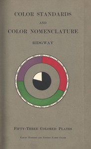
Color Standards and Color Nomenclature - With fifty-three colored plates and eleven hundred and fifteen named colors
Subjects:
Download Formats:
Excerpt
BY
ROBERT RIDGWAY, M.S., C.M.Z.S., Etc.
Curator of the Division of Birds, United States
National Museum.
With Fifty-three Colored Plates
and
Eleven Hundred and Fifteen Named Colors.
WASHINGTON. D. C.
1912.
Published by the Author.
TO
Señor Don JOSÉ C. ZELEDÓN
OF
SAN JOSÉ, COSTA RICA
True and steadfast friend for more than two-score years; host, guide,
and companion on excursions among the glorious forests, magnificent
mountains, and lovely plains of his...
Read the Full Text
— End of Color Standards and Color Nomenclature - With fifty-three colored plates and eleven hundred and fifteen named colors —
Book Information
- Title
- Color Standards and Color Nomenclature - With fifty-three colored plates and eleven hundred and fifteen named colors
- Author(s)
- Ridgway, Robert
- Language
- English
- Type
- Text
- Release Date
- August 31, 2020
- Word Count
- 17,301 words
- Library of Congress Classification
- QC
- Bookshelves
- Browsing: Art & Photography, Browsing: Science - General
- Rights
- Public domain in the USA.
Related Books
How to paint permanent pictures
by Toch, Maximilian
English
255h 5m read
Color mixing guide - For artists, painters, decorators, printing pressmen, show card writers, sign painters, color mixers. Gives color mixtures by parts
by King, John L.
English
243h 6m read
A History of North American Birds; Land Birds; Vol. 2 of 3
by Brewer, T. M. (Thomas Mayo), Ridgway, Robert, Baird, Spencer Fullerton
English
4792h 9m read
A History of North American Birds; Land Birds; Vol. 1 of 3
by Brewer, T. M. (Thomas Mayo), Ridgway, Robert, Baird, Spencer Fullerton
English
5021h 10m read

A History of North American Birds; Land Birds; Vol. 3 of 3
by Brewer, T. M. (Thomas Mayo), Ridgway, Robert, Baird, Spencer Fullerton
English
4583h 39m read
Tratado das Cores - Que consta de tres partes: analytica, synthetica, hermeneutica
by Sampaio, Diogo de Carvalho e
Portuguese
418h 2m read